Content
11 August 2026
469
18 min
5.00

Email + Google Analytics 4: How to See the Real Performance of Every Campaign

Andrii Bocharov
Content
You've sent the campaign and collected the metrics — now what? Open Rate and Click Rate give you a first result straight after the send, but the real value of analytics emerges later, once that data is tied to revenue and gathered into a trend over time. Analytics isn't a box-ticking report. It's a tool that shows whether your strategy is working, and lets you forecast the result before you even hit send.
In this article, we'll cover:
- which metrics to look at right after a send, and what they actually mean;
- how to connect email data to Google Analytics through UTM tags and see how much money a specific campaign brought in;
- which retention marketing metrics help you assess your communication over the long run rather than in a single send.
Key Metrics After a Send
Whenever we plan a marketing action, we need to understand what it will lead to. And there's only one way to understand that — look at the result. Which is why analytics isn't a stage that comes "after everything else"; it's something to work with properly from the very start.
What Opens and Clicks Show You
Once a campaign goes out, the first thing we want to know is whether the email was seen at all. That's what Open Rate is for: the percentage of people who opened the message. Technically, an open is counted when an image in the email loads.
Note
With Open Rate, as with any metric, it matters that you look not only at percentages but at absolute numbers too. You could send a campaign to the most active segment of your base and the percentage would jump immediately — say from 10% to 50%. But the number of people who opened the email remains exactly the same: 100 opens. It's just that 100 opens used to count against 1,000 contacts, and now they count against 200.
If the email was opened, the logical next question is whether it was interesting. Click Rate is the percentage of link clicks out of everyone the email was delivered to. The metric tells you how well the content itself landed: the promotion, the product selection, the free delivery, the giveaway — whatever made someone click.
CTOR (Click-to-Open Rate) shows the percentage of clicks among those who actually opened the email. Open Rate tells you whether the subject line worked; CTOR tells you whether the content inside turned out to be as convincing as the promise in the subject. You can have a high Open Rate and a low CTOR — which means the headline did its job and the email didn't.
Click Rate and CTOR often get confused, because both describe a click. But Click Rate counts clicks against everyone the email was delivered to. CTOR counts them only against those who opened it.
Let's look at an example:
Campaign A goes to a cold base: 100,000 emails delivered, 200 people opened, 20 of them clicked through.
Campaign B goes to a warm, small base: only 500 emails delivered, but the same 200 people opened, and the same 20 clicked through.
The absolute number of opens and clicks is identical in both cases — 200 opened, 20 clicked. CTOR will be identical too: 10% in both campaigns (20 out of 200). But Click Rate tells a completely different story: 0.02% for the cold base against 4% for the warm one — purely because a different number of emails was delivered, even though the content of the email and the behavior of the people who opened it are the same.
That's why CTOR is handy as a self-check: it shows whether your email content is genuinely working, regardless of the size and "temperature" of the base you sent to. Click Rate, in that sense, is more sensitive to the make-up of the audience than to the quality of the email alone.
Once you know your own CTOR across campaigns, you can forecast the result before the emails go out. Say the average CTOR across your campaigns is 10%. Then if 100 people open your next email, roughly 9–10 users will click the link. Which means you can already forecast the costs and the revenue of your future campaigns.
For comparison, we've pulled these metrics into a single table alongside benchmarks for triggered and promotional campaigns.
|
Metric |
Promotional campaign benchmark |
Triggered campaign benchmark |
|
Open Rate % of message opens |
15–25% |
30–40% |
|
Click Rate % of link clicks out of everyone the email was delivered to |
1–3% |
5–7% |
|
CTOR % of link clicks out of everyone who opened the email |
3–4% |
10–12% |
Promotional benchmarks are almost half the triggered ones. That's logical: promotional campaigns go out to mass audiences, whereas triggers are targeted communication with a specific person — especially when they're post-order or post-signup emails.
If your figure differs from the benchmark by 1–2%, that's most likely just normal variation in your base. But when the deviation is substantial, it's worth checking: something may be misconfigured, or the base may simply be inactive.
Benchmarks matter as a reference point, but from there you should analyze your own campaigns over time: compare against previous sends and improve the result.
See how to track the performance of triggered and promotional campaigns in Yespo — without manual calculations.
When People Don't Like Your Campaigns
Open Rate, Click Rate and Click-to-Open Rate show how well we engaged users with our campaign. Now let's talk about the metrics that show how much people dislike hearing from us.
This is the group of metrics that measure irritation rather than interest:
- Unsubscribe Rate (unsubscribes, benchmark <1%)
- Spam Rate (spam complaints, benchmark <0.3%)
- Bounce Rate (delivery errors, benchmark <5%)
These metrics show how relevant your communication is, and how relevant the contact base itself is. A high unsubscribe percentage can happen when users were promised one thing at the point of collection, and the campaigns don't match. A high Bounce Rate points to a problem with how and where the base was built.
Here's an example from practice. The client's problem: an abnormally high Bounce Rate, even though all the technical domain settings had been done correctly.
The cause turned out to be the subscription form's logic: the promo code was shown immediately after the email address was entered, with no verification of any kind.
Users quickly figured out they could type anything in instead of a real address and get the promo code straight away. As a result, the base filled up with irrelevant addresses, Bounce Rate went up, and sender reputation started to fall — because mailbox providers read bulk sends to non-existent addresses as a spammer signal.
The problem was solved by adding email verification at the sign-up stage, and the case is a good illustration that metrics aren't just numbers for a report — they're a way to spot a problem in time and fix it.
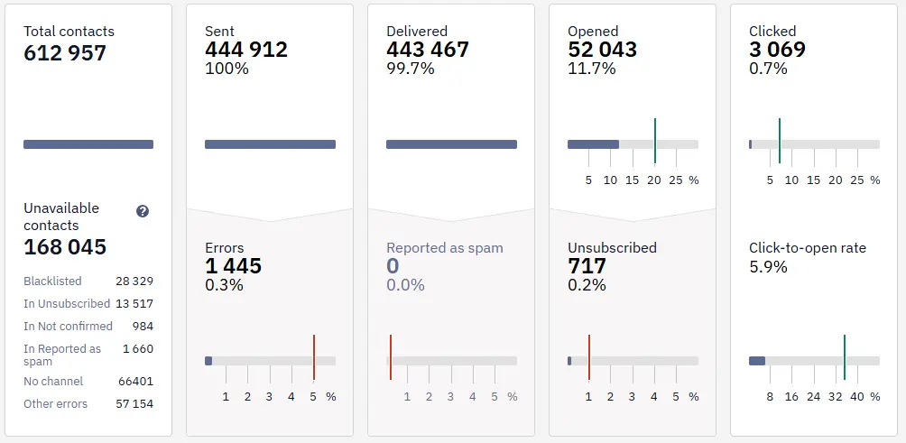
We've run briefly through the key metrics to watch after every send. Next, let's look at how to work with these metrics over the longer term.
Want to see what each of your campaigns really brings in?
How to Connect Email and Google Analytics
What's the first thing business owners look at in Google Analytics? Revenue, of course. Revenue matters to a marketer too, but it isn't the only reference point: alongside it you need to watch transactions, users and sessions, and conversion.
The problem is that Google Analytics shows all of these metrics for the site as a whole, not for a specific campaign. Even if your platform's integration with Google Analytics is already set up technically, that doesn't mean you automatically see the result of the particular campaign you sent.
Say you sent three different campaigns ahead of Black Friday — email, Viber, mobile push. How do you get the statistics for each one? Let's break that down.
From Clicks to Sales
So how do we pass the data from each of our campaigns into Google Analytics? With UTM tags. Everyone knows about this tool, but unfortunately not everyone uses it correctly or well.
UTM tags can be added to any link, and there are dedicated generators for building these links — Yespo, for example, has a separate landing page for generating UTMs easily.
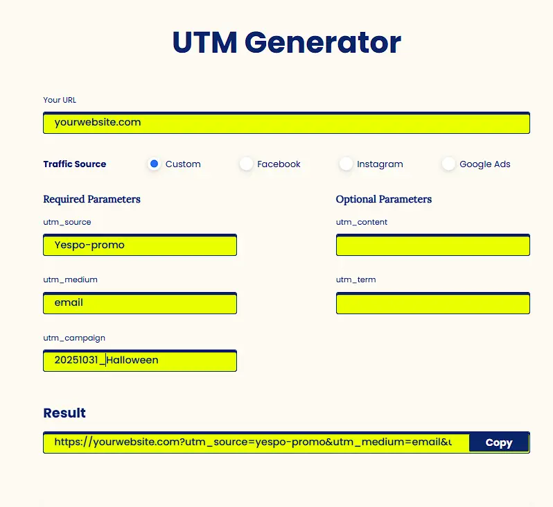
You can write up to five or six parameters into a tag in total, but three are the essentials:
- source — where the click came from. You can be as granular as you like here: simply yespo, or yespo_promo and yespo_trigger if it matters to you to see the campaign type, or narrower still — promo_women, say, for a promotional campaign to a female segment.
- medium — marks the channel: Email, Viber, Mob_push, Web_push.
- campaign — the name of the specific campaign. This is a convenient place for a date or a campaign name — 31_10 or Halloween, for instance.
The remaining parameters (content, term) are optional: add them if you need to distinguish between, say, several buttons in one email or several segments in one campaign.
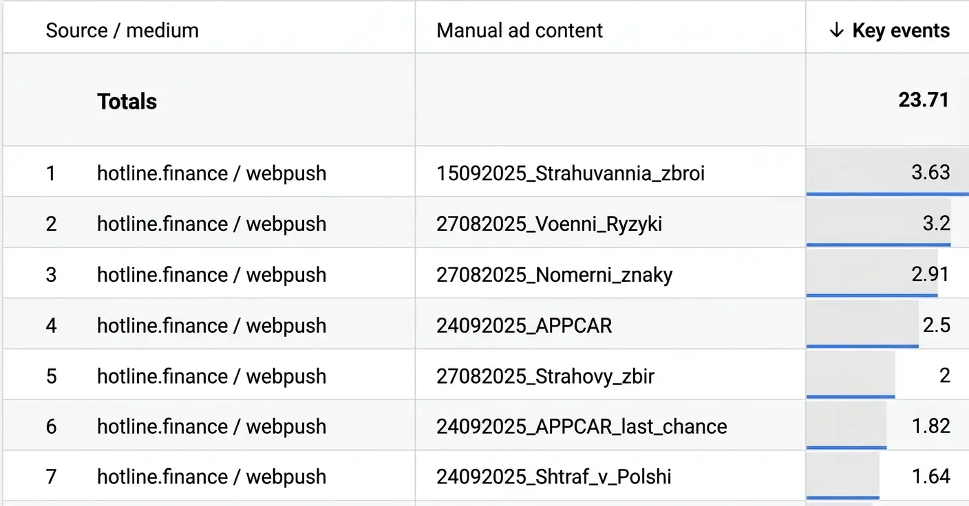
Tags let you see in Google Analytics which source, campaign, ad or button the traffic came from, and assess the effectiveness of your marketing activity.
You can also sort any campaign: by source, by channel (email, web push or anything else), by number of clicks, by number of sessions, by number of people who converted, and by revenue. It's a convenient way to pin down the result of each individual campaign. And these same UTM tags come in handy later — when we calculate Conversion Rate.
Conversion Rate from a Retention Marketer's Point of View
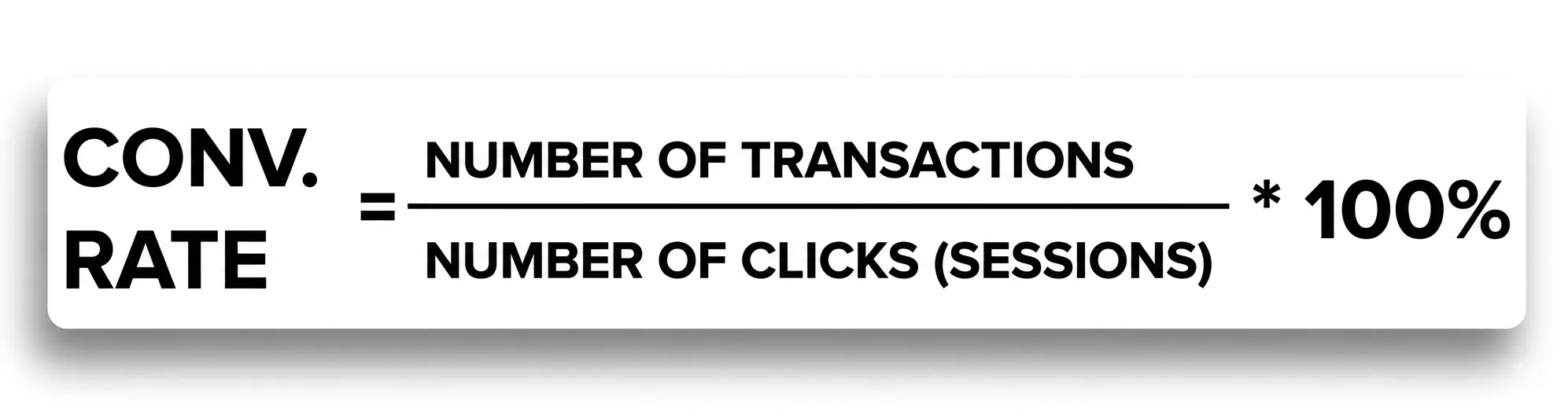
Google Analytics calculates Conversion Rate in the standard way: the number of sessions on the site that ended in a transaction. For a retention marketer, that isn't enough — what matters is seeing the conversion of the people who arrived from the email specifically, not of all site traffic. So Conversion Rate here is calculated differently: from the number of clicks out of the campaign to the number of transactions those clicks produced.
This makes it possible to forecast the result before the send. An example: a campaign goes out to 100,000 contacts, and the average Click Rate across previous sends is 2%. So roughly 2,000 people will click the link. If the average Conversion Rate is 10%, around 200 of those 2,000 clicks will turn into a purchase. At an average order value of $100, the campaign will bring in approximately $20,000.
This is especially useful for expensive channels such as Viber. If sending to 20,000 contacts costs $35,000 and the forecast revenue is only $10,000, you can assess the campaign's profitability before you even launch it — and decide whether it's worth the price, or whether it only makes sense as a brand awareness tool with no expectation of direct sales.
Want to find out how Yespo's tools can help you combine Viber and email campaigns for the maximum return on every message?
Retention Metrics
A single campaign tells you very little about the overall picture: to see trends rather than isolated points, you need to accumulate data over a period and look at it as a whole.
For this, teams keep a historical data register — either a separate document per channel or one combined file, in Google Sheets or Excel, for example. After every send, they record the number of people the email reached, how many opened and clicked (in both counts and percentages), the CTR, and analytics data: transactions, revenue, site traffic, and the percentage of contacts collected through the subscription form.
On the basis of these period averages, a business can forecast future revenue. And a long history reveals things that are invisible at the scale of one or two campaigns. Not everyone knows, for instance, that in some niches — beyond the obvious sale season of Black Friday, Halloween and New Year — there's also a hidden spring spike or an early-summer lift. Within a single quarter, that pattern isn't visible; it only shows up in two or more years of data. But if you know about these spikes in buyer interest in advance, you can prepare for the season and capture additional conversions.
Next, let's talk about the metrics most commonly used in retention marketing.
ROI (ROMI): Return on Investment
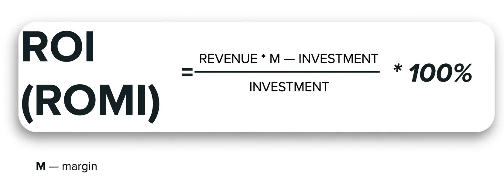
The revenue analytics shows you is turnover at receipt value, not profit. An item costs $100 — analytics will count the sale as $100, and that still isn't the same thing as net profit. To arrive at the real figure, margin is added into the calculation: cost of goods, rent, team salaries, and other expenses. That's what ROMI is.
ROMI can come out negative — and that's no reason to panic; it's a normal working situation. Promotional campaigns, for example, often have a lower ROMI than triggered campaigns: triggered campaigns are targeted communications, so their ROMI is usually better. But that doesn't mean you should abandon promo: the money earned on triggered campaigns is deliberately reinvested into promo, because promo is what generates the product views that the trigger then works on.
The same principle applies at channel level, not just across campaign types. If a channel is consistently in the red — spending more than it returns — one option is to move part of the audience into another channel, from SMS to Viber, say. You may lose some users along the way, but come out ahead on final profit.
Churn Rate: Customer Attrition
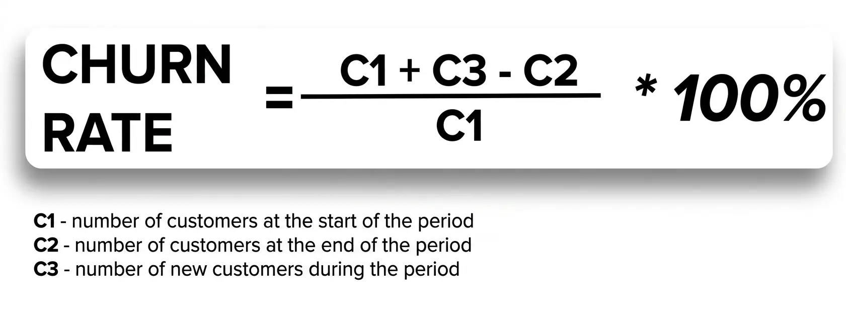
A base can grow by several thousand contacts over a year — and that looks like cause for celebration. But growth shows only one part of the picture. While new contacts are arriving, some of the older ones are falling away in parallel: they stop reading, stop buying, stop responding. That's exactly what Churn Rate shows.
If you look only at growth, it's easy to miss the signal that users aren't interested in what you're offering and are leaving — the attrition is simply masked by new signups. Churn Rate lets you see the full picture of your base and recognize in good time that your communication needs to change.
LTV: Customer Value Over Their Whole Lifetime
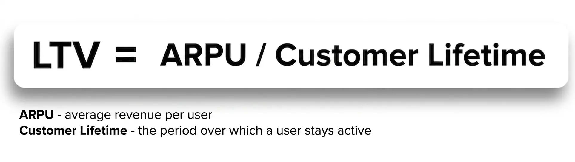
Lifetime Value is probably the best-known metric in retention. It's been calculated for a long time, and some large players — car manufacturers or household appliance makers, for instance — know in advance that once they've acquired a customer, they'll get a high LTV, because that customer will come back for servicing, consumables or their next purchase.
That's why such companies deliberately sell the first product at cost, or even below. At first glance it's a loss-making deal, but over the long run — on repeat purchases and servicing — the business recoups the investment and makes money.
The LTV formula is the same across every niche; the approach to applying it isn't. In insurance, for example, the product is bought once a year rather than several times a month as in typical ecommerce. So the period over which it makes sense to calculate Customer Lifetime is different, too: applying the LTV logic of a clothing or cosmetics store, where customers return every month, to an insurance business would be a mistake.
Repeat Purchase Rate: How Often Customers Buy Again
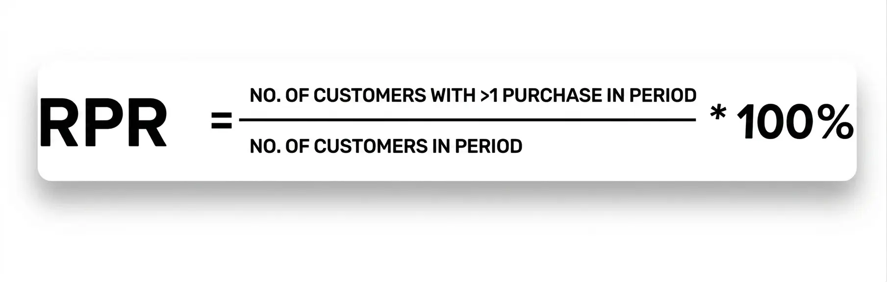
RPR shows how many purchases a user makes over a chosen period. Together with LTV, this metric gives you a practical steer: how much it's economically sensible to spend on acquiring and retaining a particular customer if they make, say, two or three purchases a year.
Repeat Purchase Rate is the basis for RFM segmentation: customers who buy often and those who buy rarely are separated into distinct groups and communicated with differently. If you know a customer usually buys once every few months, you can remind them at exactly the moment their pattern says it's time — and earn extra revenue from that reminder, instead of communicating with your whole base in the same way.
Summary
Analytics is a tool worth working with at every stage: before you build a campaign and after you send it.
Open Rate, Click Rate and CTOR show whether the email interested your audience. Unsubscribe, Spam and Bounce Rate show whether the people you're writing to trust you. UTM tags connect this data to Google Analytics and let you see not just site traffic but also the revenue from a specific campaign, channel, or even a button in an email. And retention marketing metrics give you the bigger picture: how profitable your communication is over time and how to retain customers rather than just acquire new ones.
When all of this data is gathered in one system, you're no longer guessing whether a campaign worked — you know. And more importantly, you can forecast the result before the send rather than analyzing the consequences after the fact.
Want to set up analytics for your campaigns but not sure where to start? The Yespo team will help you get to grips with your metrics, set up UTM tracking and build a retention strategy that fits your business.
Sign up for a free consultation — and we'll show you how your data can turn into forecastable revenue.