Popup (or widget)
A popup
is a window or banner that appears (pops up, hence the name) on a web page. It usually displays in response to some action to capture the user's attention. Popups can vary in size, shape, positioning, and goal and are used to present offers, gather contact details, and make visitors do something. Another name for popups is widgets.
How is it Spelled: Popup, Pop Up, or Pop-up
“Popup,” “pop up,” and “pop-up” are often used interchangeably, but they can have different uses.
"Pop up" is a verb phrase used when something appears suddenly or unexpectedly. For example, “a widget popped up when I was browsing the website.”
“Pop-up” can be both a noun and an adjective. It describes informational or advertising banners. For example, “A pop-up A has a 42% better conversion rate than a pop-up B.”
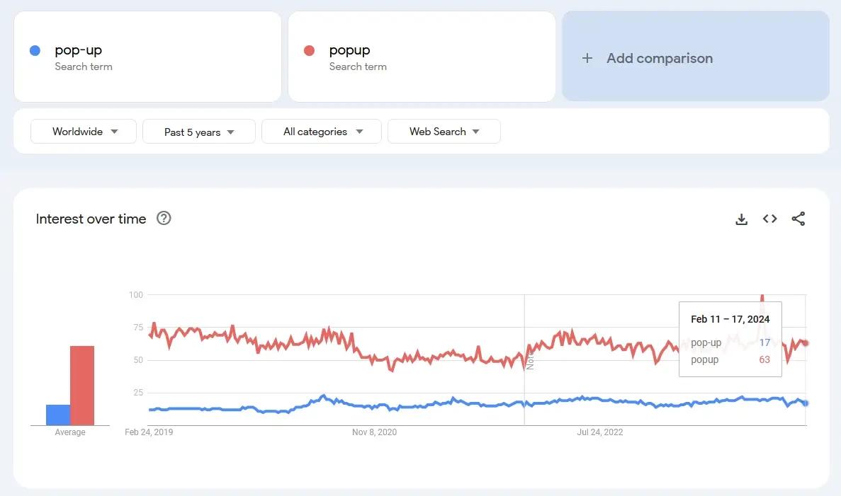
“Popup” is often used the same way as “pop-up.” Although there’s an argument that this spelling is incorrect from the grammatical standpoint, this variant is more popular among the searchers, and we’re going to use it throughout our article.
Anatomy of a Popup
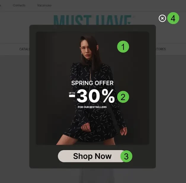
While popups can vary wildly, there are some common elements that most of them share. The order and number of these elements depend on the purpose and type of website widget.
Here are the most used widget elements:
- Image area – for product images or other pictures that make a popup more visually appealing.
- Text area – a brief explanation of the popup’s purpose or the offer. Depending on the style, it can be a singular block, or it can be split into a headline and a body text.
- Call-to-action (CTA) button – by pressing this button, the visitor will perform the intended action. Usually, the button has text explaining what is expected from the visitor.
- Close button – closes the popup and gets the visitor to where they were before.
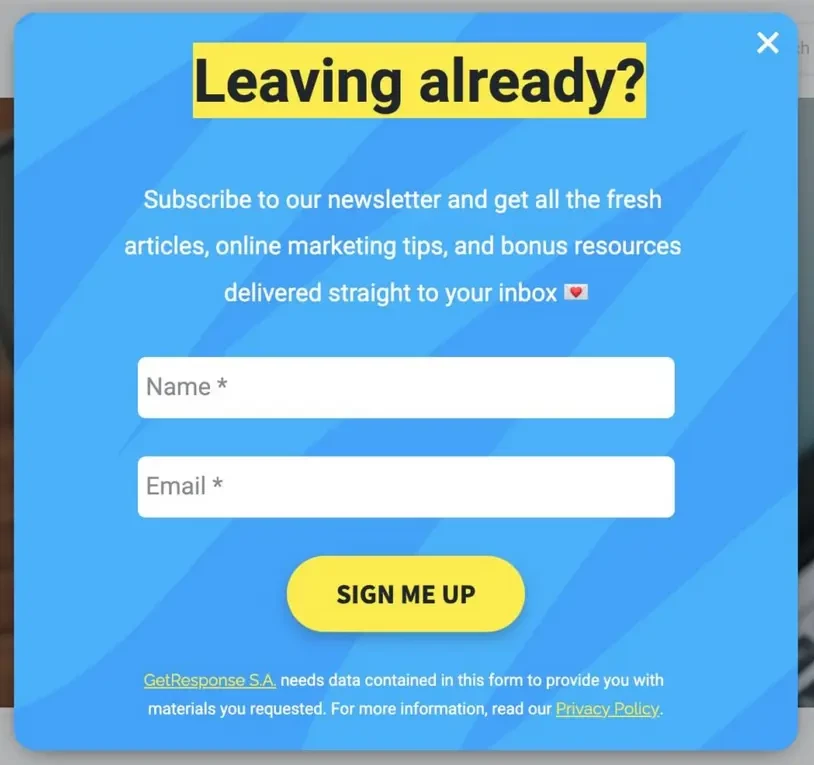
Other elements that can be found in popups include:
- Form fields – to type in name, phone number, email, or any other information. These are great for capturing more visitor information so they can be reached later through different channels.
- Links – usually for privacy policy, terms and conditions, and other legal pages.
- Checkboxes – sometimes these are included, so the visitors can provide an explicit agreement to terms and conditions or answer questions with predefined options.
- Secondary text areas – more complex popups can feature additional text areas with descriptions, explanations, and other useful information.
- Additional buttons – certain popups can feature more than one button. For example, a secondary CTA or a close button in the same visual style as a CTA.
- Navigation elements – scrollbars for larger popups or navigational buttons for popups with multiple pages.
- A spin wheel widget could also be included as an element that incorporates gamification into the user experience, allowing visitors to interact and potentially receive a reward after spinning the wheel.
The Most Common Types of Popups
Popups can be split into multiple types based on design choices and their goals. One important way to streamline the popup creation process is by using pop-up templates, which offer pre-designed layouts that can be easily customized to fit your specific needs.
Examples of these breakdowns include:
- By layout: Inline, floating box, floating bar.
- By goal: Subscription forms, informers, surveys, sales lead forms, etc.
- By triggers: Exit intent, time on page, specific page, location-based etc.
Users of Yespo can access six main categories of widgets.
Subscription forms. These popups are meant to capture visitors' contact information. Usually, email capture form gathers email addresses, names, and phones.
Clickable popups to inform visitors. Informers can include promotions, discounts, new arrivals, calls to follow on social media, and coupon popups. Coupon popups are particularly effective in encouraging immediate action by offering visitors a discount or special deal in exchange for a purchase or other desired action.

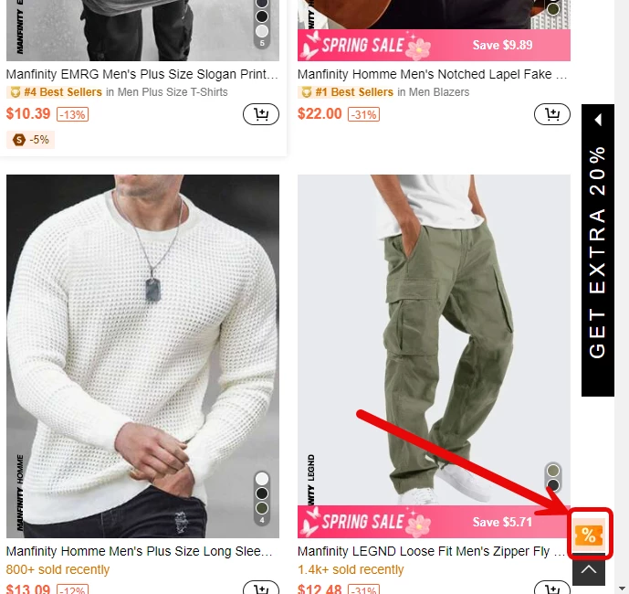
Launchers. This is a simple button that allows calling another widget whenever it’s convenient for the user. It’s a non-intrusive popup that doesn’t interfere with the browsing experience and won’t annoy the website visitors.
Age gate. A popup that prevents users from entering certain parts of a website until the visitor confirms their age. It is often used for stores that sell alcohol, cigarettes, and related products.

Survey. A reliable format when businesses need to gather additional information or contact data from the visitors.
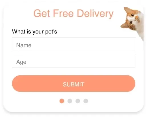
Slider. A straightforward widget that combines multiple widgets in one. A good way to display a couple of products or calls to action within a single placement.

Popup Best Practices
Popups can be a great tool to increase sales, connect with visitors, and provide additional functionality. However, when misused, they can negatively affect user experience. Here are some tips on how to improve popups:
- Consider timing: Use them at the right moment, like when a user is about to leave the website or is browsing a specific product.
- Prioritize relevance: Ensure popup content is relevant to the webpage or user's interests. Personalize the experience and don’t show everyone the same content.
- Don’t neglect design: Make them appealing, consistent with your visual style, and easy to close.
- Be mindful of frequency: Don’t overuse them to avoid annoying visitors. Less is better. By overusing popups, especially during the same session, you may lose customers. Yespo users can activate Annoyance Safeguard to reduce the risks.
- Feature the value proposition: Offer something valuable, like discounts or useful information. Present it in an easy-to-understand form. If you are running a limited-time offer popup, consider using a countdown template. Displaying a countdown timer showing how much time is left until the offer expires can create urgency and encourage visitors to take immediate action.
- Optimize for mobile: Ensure they are mobile-friendly, as they outperform desktop by 3.1% in terms of conversion rate on average. Test that it shows correctly on different devices. Check if it’s easy to click buttons, fill in forms, and close the popup on mobile devices.
- Have a clear call to action: Guide users on what to do next. Your buttons and text fields should clearly explain what is going to happen when visitors click on your popup.
- Always be testing: Regularly test different popups for effectiveness. Try different formats, layouts, types, copy, CTAs, and offers.
This should provide you with a solid foundation of understanding widgets and how they can be used in ecommerce. However, we just scratched the surface with this article. If you’d like to learn more about this powerful tool in any marketer’s arsenal, be sure to check our blog for more related materials.
Join Our Blog Newsletter!
Stay updated with our latest email marketing tips, product news and case studies.
Terms in the same category
Online retail Customer Profile Insight Revenue Optimization Bounced Email