Header
Heаder is the first thing a user sees when they open an email or visit a website. In this article, we will reveal what it is and what it should look like.
You’ll learn what's best to put in your website and email header and tips on how to design it optimally with examples.
Heаder: What Is It
A header is the top part of a website or email. You have only a few seconds to grab the attention of potential customers with a beautiful and informative header. If done correctly, the user will start scrolling and reading your website or email.
The header and footer frame the content of the website, so you need to pay special attention to them during development. Users view a page according to the zigzag principle (Gutenberg diagram): first, they look at the upper left corner of the opened window, then at the upper right corner, and only then look down.
The header is key to attracting attention and creating a first impression. Let's take a look at how to make this impression positive.
What to Place in the Website Header
You can add to the website header:
- elements of brand identity – company name, logo, mission, slogan;
- contacts – address, phone number, email;
- a menu with the main categories of the website – both horizontal and extended vertical;
- a search box on the website (relevant for large online stores, marketplaces, and information resources);
- a subscription form for email and push notifications;
- login and registration button on the website;
- the company's current offer and information about discounts and promotional offers;
- a switching interface languages button, a link to the mobile version or theme for visually impaired people;
- the cart icon, which displays the number of added products (must be used for online stores);
- an icon with a choice of country and city (relevant for aggregators, marketplaces, and online stores);
- appropriate graphics and high-quality images that correspond to the brand's theme and clarify what the website is about (optional).
Remember that the header should not be overloaded. First, determine which elements are most important to you. Be sure to structure them so that users understand and it's obvious where to click and why.
Intuitive navigation will help retain visitors and extend their time on the website.
Please note!
The main page header may differ from the headers of other pages on the website. Usually, secondary pages use a stripped-down version that contains only the most important information: a logo, a horizontal menu with categories, a button for switching languages, cities, login and registration, and a shopping cart.
How to Make a Header for a Website: The Main Principles
To create a successful website header, follow the rules:
1. Add your contacts, logo, and offer in a prominent place. The logo is usually set in the center or upper left corner, and the login or registration and language switching buttons are typically placed in the upper right corner
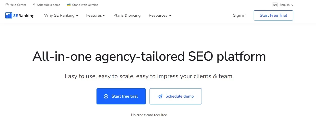
2. Stick to the recommended header size. For informational resources, the height of the header should be between 100-200 pixels; for corporate websites, landing pages, and single-page websites, it can be increased to 300-500 pixels.
3. Use a drop-down text menu. This will help avoid overloading the header with information and allow users to find what they are looking for.
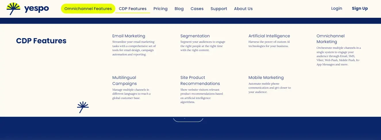
4. Fix the header on the page so that it moves while scrolling and always stays in view. Note: the header should not overlap important information and interfere with the content of your website.
5. Develop a unique header design. It should be consistent with the overall style of the website and brand. Use corporate colors and fonts, graphics familiar to visitors, or brand characters if you have them. Watch the weight of images and compress them using special services for faster page loading.
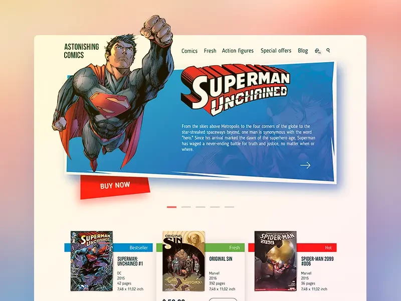
If you don't have a corporate style and colors, choose a palette for your header that suits a specific niche. The same rule applies to header images.
Make sure that the visitor understands what your company does at a glance. For example, a home appliance service center can place an image of a washing machine, refrigerator, microwave oven, or a photo of a repairer in the website header.
Website Header: Examples for Different Niches
The header design and its elements depend on the company's niche. Let's look at a few examples of website headers for different business areas.
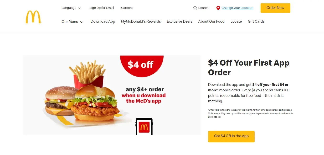
The Header for the HoReCa
In this area, they often cut down the header to accommodate a slider that allows you to show photos of dishes and several offers simultaneously (for example, promotions and discounts).
The header usually contains links to the menu and the section with the best deals, a button for authorization, and a cart icon. If the company has a delivery service, the header should contain information about it and contacts.
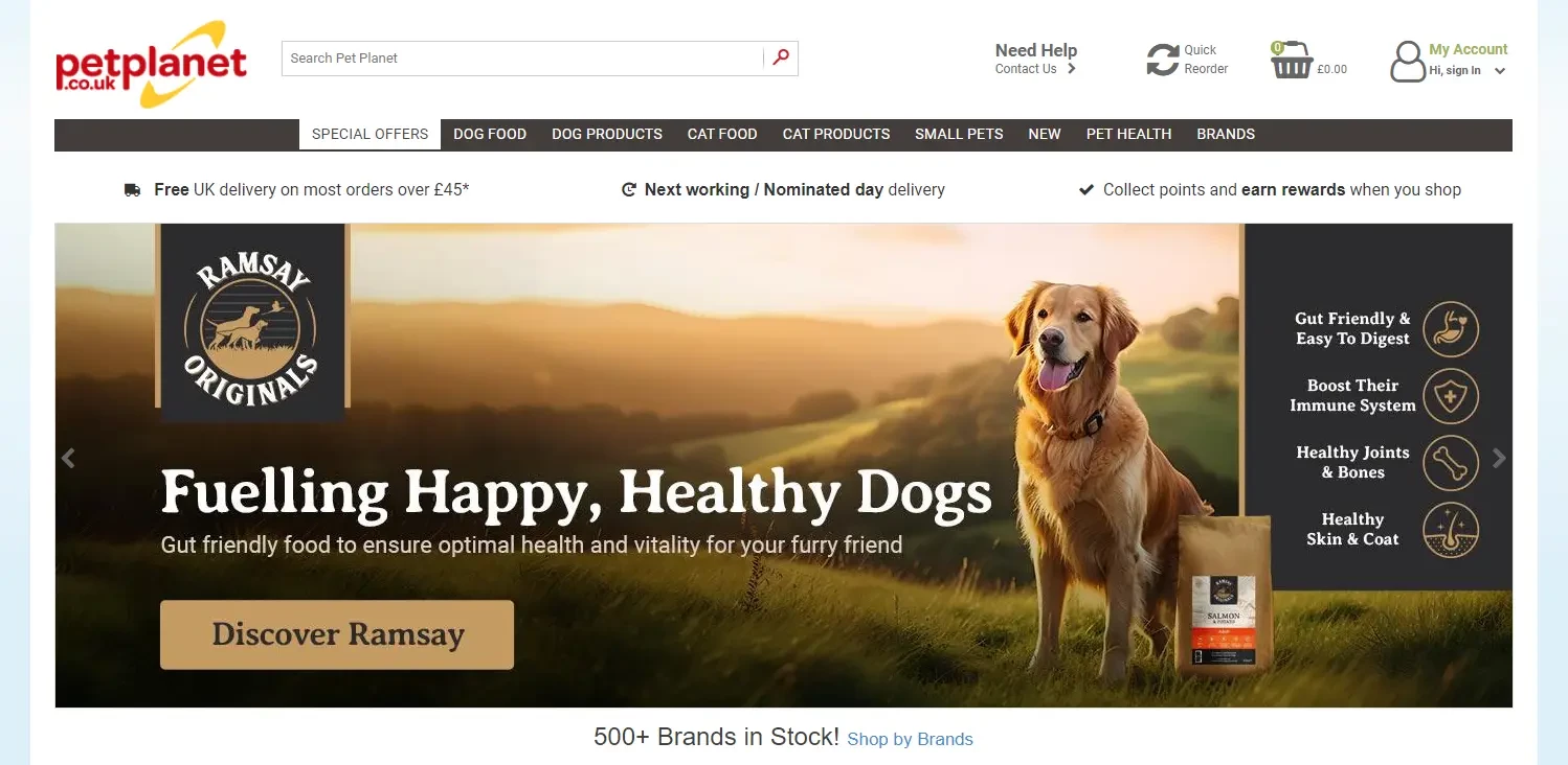
The Header for an Online Store
For ecommerce, it is crucial to immediately draw the visitor's attention to the company's capabilities that differ from others, show the product catalog, and encourage them to place an order.
That is why several menus are often used in the headers of online stores: a separate menu with service pages, promotional and popular offers, and key business categories. These can be different catalogs or a “hamburger menu” with website sections that open on click or hover. In addition, the header usually contains a shopping cart icon, a button for registering and entering your personal account, product comparison, and contacts.
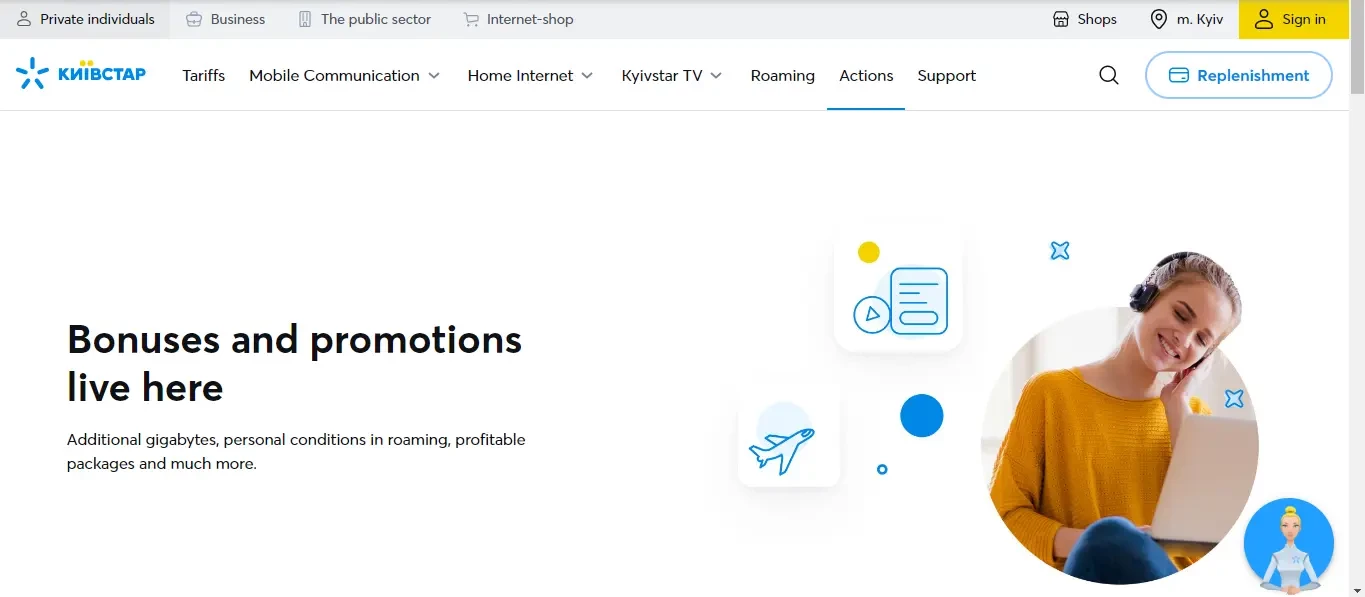
The Header for a Service Sector
The header on service sector companies' websites often contains a contact button or CTA, social proof, or key brand benefits. It also includes the menu, contacts, and shopping cart. Sometimes, an offer is placed in the header or, on the contrary, the header is cut as much as possible to place a wide banner with a USP on the first screen.
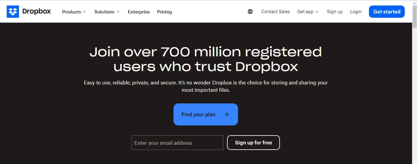
The Header for SaaS Websites
The header of such websites most often contains a drop-down menu of products or a “hamburger menu.” There are also tabs with prices, knowledge base, support, and information about the company.
The top right corner usually contains buttons for ordering a demo or feedback, switching languages, logging in, and registering. Some SaaS companies add their mission statement to the header.
The Header for a Personal Website
Such websites are developed for media personalities, show business stars, politicians, and industry experts. The header of a personal website often contains a photo of the person who owns it, a menu, and social media buttons.

How to Make an Email Header: The Main Principles
The header and preheader are the first things subscribers pay attention to when they open an email. It's important to immediately interest the reader and motivate them to read the email to the end. To make your email campaigns effective, you can include the following elements in your email header:
- brand logo, which immediately makes it clear from whom the email came;
- menus of the most popular sections of the website and product categories (this technique is often used in ecommerce);
- a link to the email web version so that the reader can view the email in a browser if it is not displayed in the email service.

- offers that will interest subscribers;
- the company's slogan, which is used for brand positioning;

- social media buttons for quick access to the company's business pages;
- contacts (phone number, website, office, store address, etc.)
- a picture that attracts the readers' attention.
If you need more clarification on creating a good email header, entrust this task to the Yespo team. We'll design an email template to make your newsletters have the desired effect on your subscribers.
Get an email template for free
You can also create your own email design using the Yespo CDP email editor. To make email creation more manageable, use the built-in artificial intelligence, which helps you generate email text, correct mistakes, change tone of voice, translate messages, etc.
Join Our Blog Newsletter!
Stay updated with our latest email marketing tips, product news and case studies.