13 October 2020
11048
14 min
5.00

How to Embed Images in an Email Properly
Embed image in HTML email is one of the most popular search requests for a good reason. The power of visuals is nowadays bigger than ever for many reasons. First, nobody has time (and often will) to read. People scan and digest images faster than text. Second, social media, who have the biggest power in the modern world, are the biggest advocates of visuals. The quick content they thrive on 99% consists of images. Third, it’s easier to get your brand associated with a particular image than text (even if it’s a really good motto).
As an example, take a look at the recent marketing campaign TBWA\Paris made for McDonald’s (Source). There is no logo or text in any image, and still you know who these billboards belong to.

Email marketers also recognize the power of images using them in 99,9% of their campaigns. At the moment I can think of only three types of emails that don’t typically include pictures – warnings, error notifications, policy updates and apology emails.
Of course, brands send text-only messages from time to time. But it’s rather a design technique (to stand out against other campaigns) than a tendency. It’s hard to deny that any product looks better when supported by quality email images.
Images for Email Marketing: Types and Why to Use
Let’s agree that within this article I’ll refer to any visual piece as to an image. However, technically some formats go beyond this category.
So what image can you embed in an email? Any you like.
- Product image;
- Photo;
- Banner;
- Background image;
- Logo;
- Icons;
- Drawing;
- Artististic illustration;
- Comics;
- Infographics;
- Chart;
- Animation;
- User-generated content.
Speaking of the latest trends, dark design, 3D, isometric images, geometric shapes, CSS animation, flat icons, and abstract illustrations are the practices that dominate the current email template layout.
And this is why marketers, designers and photographers put so much effort into creating good images:
- Emails with images are easier to scan and digest.
As I’ve already said above, our brain faster processes the info transmitted via imagery than words. Look at these two emails and tell which one is more appealing.

Note also that this is a short copy, yet images make it more reader-friendly.
- Images structurize the copy.
Email marketing images aren’t for decoration only. They also help frame the email body and shape the content inside into blocks and sections.
- Images give your product a better display.
- Images are informative.
Illustrations make guidelines and instructions easier to perceive and follow. Charts and infographics help deliver numbers and percentages.
- They transmit emotions.
- They tell a story.
One image can tell more than a hundred words. And since your email isn’t a Charles Dickens's novel, you may be limited in space. Images help send the message, saving the copy length.
- Images make content on their own.
If you send regular campaigns (4-5 emails per week), coming up with new ideas might be challenging at times. However, a couple of nice pictures (product recommendations, users’ photos, challenge results, etc.) can build you an entire message.
- They can promote brand recognition. (See the below example with McDonald’s).
- They are beautiful (mostly).
Free HTML templates for easy image processing
How to Embed Images in an Email the Right Way
I can’t speak about the rest of the platforms, but in the our drag-and-drop editor it’s rather simple to insert images in emails.
You simply select a template or already created message, click the necessary image and choose to replace or edit it.

When opting for replacement or adding a new image, you can upload one from your computer or external sources, select it from your gallery (files you’ve already uploaded) or from the system’s bank.
You can also edit any image: resize, crop, transform, add text, change the background, etc. This allows you not only to optimize certain pictures for the particular template, but also create a banner straight in the editor.
And moving to the images themselves, these are the technical and design things to pay attention to when embedding email HTML images.
Color Mode
Make sure you select for your emails images in the RGB color mode. It’s optimized for digital rendering, unlike the CMYK mode that is better for printed images.
Dark Mode
Dark Mode for emails is gaining popularity, especially among smartphone users. It enables to shift the interface background from light to dark, rendering the colors to their lighter versions. It works differently depending on the email client, OS and gadget type. Plus it’s difficult to predict what mode your subscribers will use to open each particular email.
However, there are several advice pieces to follow:
- Optimize your logo for Dark Mode. A black logo will disappear against a white background.

- Optimize the background for the logo, product cards and photo of people. Always use a transparent background, as a white background would look a bit messy and unprofessional in Dark Mode.

- Make the background of the container or stripe colorful. Any color but for white won’t be rendered in Dark Mode and will keep its original display.
File Weight
The weight of the images doesn’t impact the email size. However, it may affect its upload speed or distort its display on different gadgets.
In our editor, you can upload images of up to 2MB and 72 DPI. However, I’d recommend sticking to 1MB: it’s enough for the correct display and quality of your images. If you need to reduce file size without losing clarity, consider using an HD photo converter to optimize images while retaining high resolution.
Image Size
The size of the HTML email image depends on the template width and design of each copy. In our editor, the default email width is 600 pixels. You can customize it if needed in General Settings.

And using the standard width, you can keep in mind the following sizes:
- 560-600 pixel – for full-width images (for example, banners);
- 250-300 pixel – for 2-grid layout;
- 160-200 pixel – for 3-grid layout (for example, product recommendations).
These are not requirements but just some references to get started with. After you get acquainted with the editor and its basic templates and create enough of your own, you’ll know which image fits them.
Also note that indents between containers within a structure and padding inside containers also affect the size of the image inside.
Image Ratio
Be careful with too many visuals without any text inclusion. Excessive images with minimum text are one of the triggers for spam filters. To avoid problems with deliverability, stick to the 60/40 ratio: give 60% of space to text, and 40% to images.
Alt Text
In case your subscribers can’t (or opt not to) upload images in emails, added alt text will help understand what they aren’t seeing.
Alt text (stands for alternative) is an image description that appears in the container instead of the blocked image, describing it. If you don’t add alts to your images, recipients will see just an empty box.

Alts are also needed for accessibility purposes. They help people with visual impairments who use screen readers to read your emails.
Things to keep in mind when writing alt text:
- It should be descriptive yet as short as possible. For images of physical objects, use a precise description of the piece, for example, male shoes SAFARI, winter 2020. For non-object images, convey the message so that the recipients understand they’re reading about. For example, the alt text for the banner should be something like 20% off male winter shoes.
- Don’t repeat the same alt text. Write different alts for each image, even if you place similar products. The same male shoes used in the email 5 times in a row will rather cause confusion than contribute to accessibility.
- Differentiate between an image title and alt text. If you add titles to an image straight in the copy, consider skipping alt or writing different text. Otherwise, people will see or hear via the reader two similar phrases one after another.
- Add an empty alt attribute if applicable. There are images (divider, decorative GIF, repetitive logo) in the email that are used for design purposes and convey no meaning. For them, add an empty alt attribute – alt=”” – to the image code. Screen readers skip images with an empty alt so people won’t be bothered with unnecessary info.

Mobile Responsiveness
According to The 2019 Email Client Market Share by Litmus, 41.9% of emails are opened on a mobile device. This means that almost 1 in 2 of your emails are likely to be read from a gadget. And they should better be optimized for this.
There are several factors that affect the mobile friendliness of your messages:
- Template layout;
- Grid;
- Image size;
- Image format (PNG, JPEG, GIF).
In our editor, they’re already considered. The functionality Responsive image is enabled by default for all images. They will be optimized for the screen width of the device the subscriber will use to open your emails (provided the device itself supports it).

Plus, you can always preview the template in two modes – desktop and mobile – to see whether all elements, including images, are displayed as intended.

Rollover
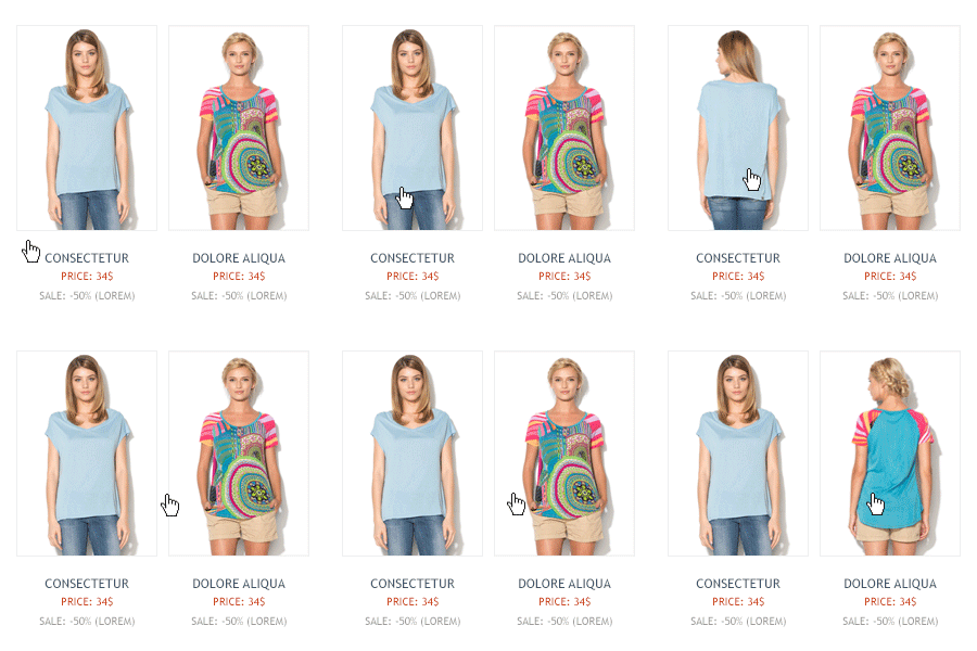
A rollover is an effect that changes the image to another one when the image is hovered over.

This functionality can serve many purposes:
- Give your product a display from different angles;
- Show how it looks on a real person;
- Display the range;
- Provide detailed information;
- Give more details on functionality;
- Enhance CTA, etc.
To add a rollover in our platform, enable the corresponding option and upload the second image.

Keep in mind:
- A rollover effect is only used for images.
- You can only use two images as a rollover. Both should be of the same size.
- You add only one alt text to a rollover. It will be applied to both images.
- The feature is supported by Gmail, iCloud Mail, Outlook 2003, Apple Mail, Yahoo! Mail, AOL.
- It’s supported only on desktop as touchscreen devices don’t allow hovering. For mobiles, you can add a block with the image that will change upon tapping.
AMP Carousel
A relatively new functionality, an AMP carousel is a more advanced version of the above-mentioned rollover and also belongs to dynamic images in email. It enables to display several images within one container. It’s a good solution when you need to deliver an offer that requires to imbed more than one picture for good promotion.
For example, take a look at this yoga fest invitation. The text gives only a brief description, and images complement it with extra details. You see that the event will be outdoor, held as a group class, and there will be classes for pregnant and collective cooking.

In our platform we have a ready AMP carousel block implemented in the editor. You only need to drag it to your template and fill with the necessary content.
Keep in mind:
- To send AMP emails, you need to be registered with Gmail as a dynamic sender.
- All images should be of the same size so that your carousel doesn’t look distorted when being flipped.
- There should be alt text and a link for each image. Without links, AMP content won’t be rendered.
- Not all email clients support AMP. Create an alternative HTML block to ensure all of your subscribers receive the message.
350+ free templates easy to use in a drag-and-drop editor
How to Send HTML Emails with Images: Tips for Faster Work
And here are some quick tips that will help you manage images in our editor more effectively and create new emails faster.
- You can upload and save new images in Prepared and Common. Saved in Prepared, they will be available only for this particular template, Saved in Common, they’ll be available for all your templates. You won’t have to upload it every next time.

- You can save entire containers and blocks as a module and use them in further templates without or with minor editing. It’s especially useful for headers, menu, banners, team members, contacts, and footer.

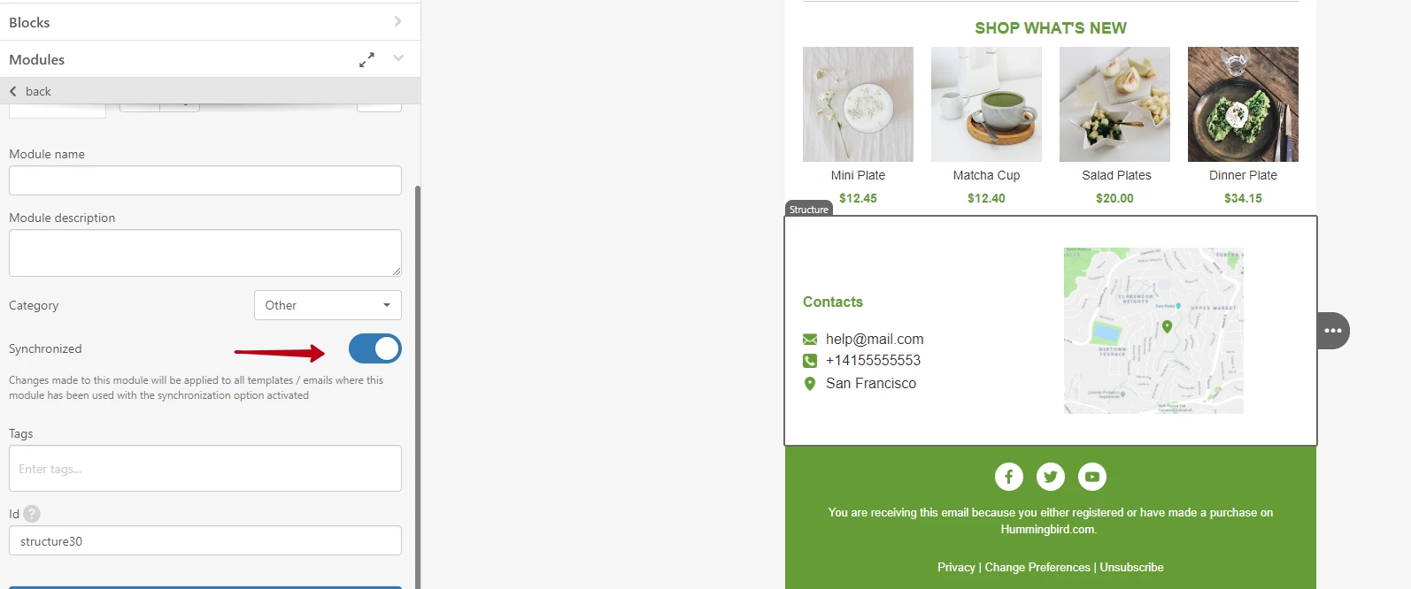
- You can also make such modules synchronized. This way the changes made to one template will apply to all templates that include this module. It really saves time on repetitive routine as you don’t have to edit each template manually.

- We have a big variety of ready icon designs available in the editor. You don’t have to create and then add them manually (unless you’re after a super custom option). Just pick those you like most.

- For blocks with product recommendations, it’s possible to set up containers with dynamic content. The system will automatically fill them with the right product info, including images, based on the product feed from your website that you upload to the system.

Images in emails play many important roles. They catch the attention, entertain readers, promote offers, diversify content, and are capable of turning your emails into art pieces. Your task is to use this awesome tool properly and ensure the right image display under any occasion – different modes, on different devices, in different email clients, etc.
The best way to do so is to read carefully the above and test your emails before sending. Email clients regularly change their rendering algorithms, so don’t rely on last year's results. And of course, feel free to contact our support when needed. They are really friendly, reply in no time and will help you embed any images in email.


