31 August 2017
7632
13 min
4.02

100+ Basic Lifehacks for Emailing
You can find in Internet so many recommendations like "make your email personal," "motivate to visit your website" etc. Sounds good, but how to do it? Even the advanced marketer would like to have a kind of “crib” to look in and find something useful. In the following article we compiled some practical advices we overheard, borrowed and tested; you can argue, verify and involve all of this email marketing best practices.
Open Rate
There are many factors that impact Open Rate but the most common are three: Email sender / Time / Subject. Time factor is quite complex topic to discuss, and you can see the real situation only in process of testing, or calculating the Heat map. But subject and sender are much more interesting to talk about.
What may be effective for Subject line?
-
A subject that consists of one or two words. This is not only intriguing but also good-looking for mobile devices
-
Trend words and slang. Of course use it rationally, and only when it is suitable for your audience
-
Put #hashtags, #a_lot_of_hashtags. This way, each word will be separated
-
Use quotations from songs, poems, movies. Of course from popular ones, not from underground that only you and a few of your friends know.
-
Make play with popular holidays, this is certain success. Do not use the first things that comes to mind – 99.9% guarantee that everyone shall do the same.
-
Promotional code in the subject. It makes user open email because code is hard to copy from the subject.
-
Subject essence in square brackets
-
Subject that consists of characters only
-
Personalization by city, interests, clothes sizes etc., not by name
-
Add preheader to email subject
-
Define and periodically use the top subjects (Do not open, We have two news for you). But not very often, or you will be caught
-
Create your information guides at least once a month. Curiosity will make user open the email to find out what the holiday is now.

What should we specify in Sender line?
-
The name of manager. This is the best for email campaigns that need personal treatment (f.ex., reactivation messages).
-
A special symbol that emphasizes your business
-
Add quotes, brackets or lines
-
Different sender names for different email types
Design
There are some email marketing best tips you can easily put into practice not even involving the designer :) First of all, design doesn`t mean just a good-looking banner or pictures in email. Design is a complex structure of the whole message even including the smaller elements (like dividers) that can make email better.
CTA buttons and links
-
Add CTA button to the end of email. This button often provides the most part of redirects.
-
Arrow keys or animation used in CIA button design attract user’s attention
![]()
-
Use emoji in buttons and headers
-
Add sales links to your preheader
-
In email header, highlight "Sales" with brighter color or use verbs to emphasize it
-
Add “Change interests” option
![]()
-
Add CTA button with website link right below the email header

-
Ask your questions before the CTA button or link. (Want to know how does it work? Just visit our website ->)
-
Propose the customer solution way in the button (Choose for me, What did stylists designed for me?)
Social networks
-
Make a special field for social networks in your email newsletter; use only one network button for one email to collect more clicks
-
Add the number of your social network group subscribers

-
Add the social networks invitation emails to your Welcome messages
-
Add “Share” buttons to your emails
Content and decorations
-
Provide the detailed description of your goods

-
Add the info that helps to learn more about the users in one click and then use it in further mailing

-
Make “Add to Google Calendar” option for your interesting events using the link
-
Use the client nickname if your website requires logging-in
![]()
-
Add the option to share the particular blocks of email
-
Sometimes you may compose emails in the same color range

-
Add photo when sending email newsletter on behalf of the manager
-
Catalogue of goods is sometimes better than long descriptions. (Roman.ua)
-
Add questionnaires right to email body, not by redirect link
-
Use the visual frames when designing email

-
Provide the ready sets and images of your goods

-
Add comments from the website to stimulate customers to order your goods and share their opinion.
-
Design the descriptions of your goods

-
Remove the client’s name, greeting etc if email doesn’t require personal treatment
-
Too little text? Larger fonts and alignment by center will be a kind of “visual funnel” for the CTA button

-
Add popular products or sales of the week after the main proposal of your email
-
Add the screenshot of search engine from your website, it attracts user’s clicks too
-
Add the map with your shops locations to the website footer
-
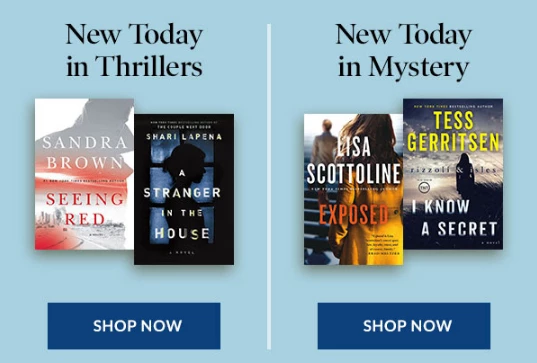
Use horizontal and vertical dividers
-
РDivide your email into separate semantic units
-
If your discount is valid offline - add "Print discount" button
-
Use quotations, they are shared well

-
You can periodically change the products description cards, three-two-one goods in a row
-
Make play with block sizes

-
Use dynamic content to collect data

-
Banner in the first screen increases transfer rate of the entire email - do not forget about it
-
Sometimes you can send Plain-text messages
-
Personalize emails not only by name but also by interests, cities, views, etc.
-
Make accent not on goods only but on a ready image / set
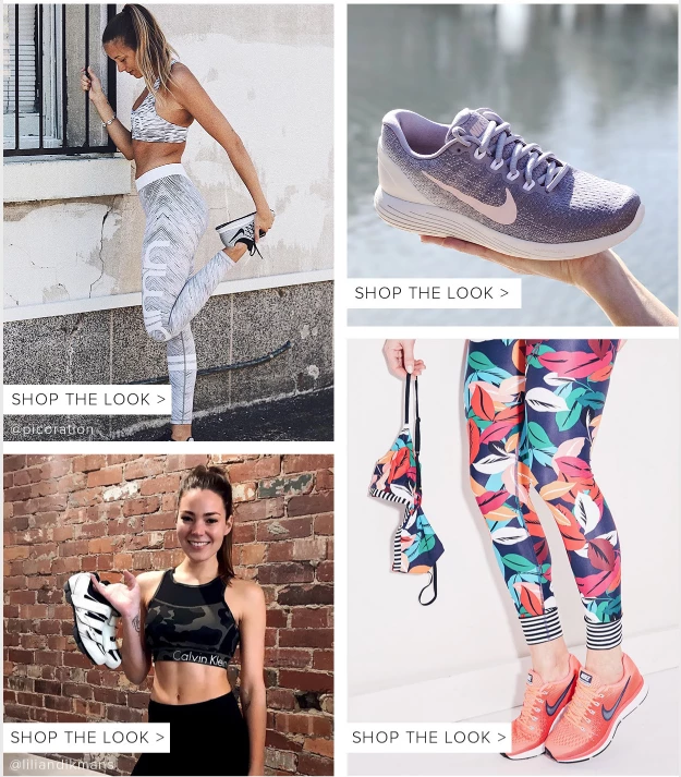
This is how it looks when redirecting to website:

-
One email - one action. There may be some additional options but they should not overshadow the main offer
-
Include the manual on how to use the promotional code (or demonstrate it schematically)
-
Speak about your advantages, repeat your slogan
Pictures
-
Replace descriptions with graphics and infographics

-
If the entire email consists of pictures only - add at least the brief info about the company or sales terms beyond the footer. Protect yourself against the nitpicking of email services
-
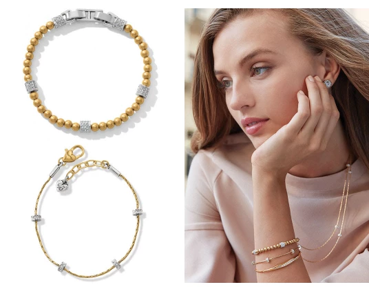
Add the pics of how product looks in real size / on models
-
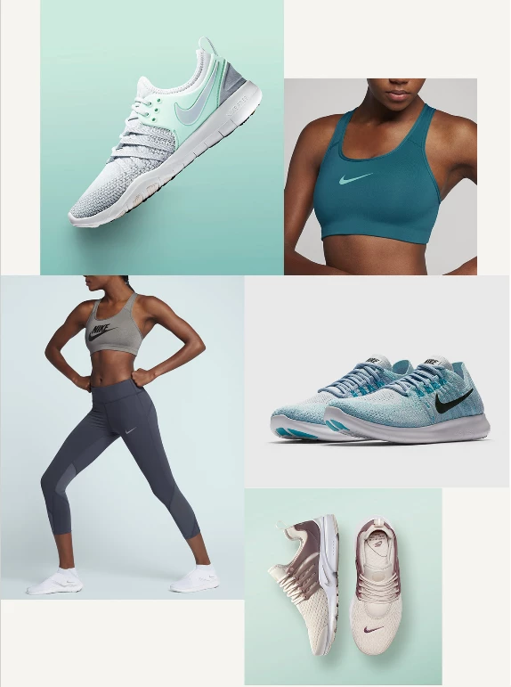
Get rid of these boring “top / bottom” or “right / left” alignment types
-
If you use the decorative calligraphic fonts - use the pictures, let clients see your email just like you planned it
-
Picture resolution is everything. Say "No" to pics from the stocks and with gritty, earthy-gray faces
-
Add price categories for customer convenience
Header
-
Add animation to the “Sales” block or popular category - highlight it
-
Add “Enter your personal account” link to the header
-
Show the bonus card balance, the accumulated bonuses
-
Replace the descriptions with icons or vice versa. Then look at user's preferences
![]()
Animation
-
Replace the product manuals / service descriptions with animation gif
-
Show the goods represented in the promotion

-
Do not make the entire email animated but use it as accents
-
Use no more than one animation for one scrolling
-
Show products from all sides
-
Add an animated "Play" button to the screenshots taken from video
-
Make a GIF animation from the video fragment and add it to email. It will urge user to watch it full; so, the click is needed
-
Add links to previous newsletters
-
Plan the animation in such way that will motivate user to read full email and stay at the message page longer
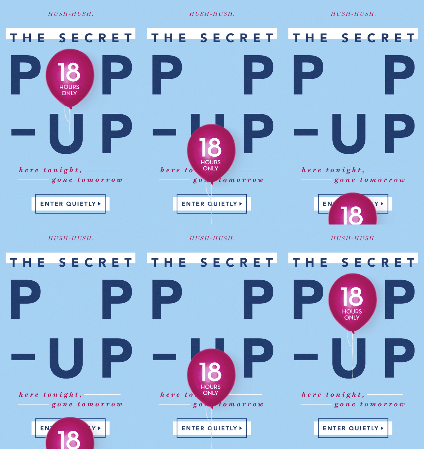
How to make clients read your emails down to the bottom?
-
Add more “air” to emails
-
Make them to know that best offers or promotional codes are usually hidden somewhere at the bottom
-
Hide some blocks when viewed on phones, so they will not extend email
-
Arrange the zigzag-shaped visual guides (arrows, chains, threads) extended down to the end of message

-
Number the products

-
Set the goods in such order when every scroll demonstrates the “tail” of the next product; so, user will scroll further because of curiosity
Sending emails
Some simple ways how to keep your subscribers and not make them bored of the same monotonous subjects. So, try to send emails:
-
Not before events but after (holiday, movie premiere etc.)
-
Send repeatedly to those who did not open the first time, but with a different theme
-
Make a schedule of competitors mailings and do not send emails at the same time with them
Newsbreak
-
Send info mails sometimes. Promo messages can make users get tired
-
Tell about your features, website updates (having in mind the client’s profit from this information)
-
Invite clients to your updated website / new section and ask their opinion.
-
Catch the trends (check what is mostly talking about right now). There are 3-4 days until the news is on the top, then interest decreases
-
Images, habits, life style of media stars is a good motivation to buy
-
Send successful email again only changing the subject and banner
-
Find common “pains” (even a little trivial) that are familiar to your subscribers

Offer
-
Set the limited terms, up to a maximum of 5 days
-
Add products sizes, colors, models etc.

-
Make special promotional codes for subscribers (club members)
-
Divide the message into chapters, or consecutive steps

-
Make special blocks with groups / sets of goods
-
Special proposals and collections for calendar holidays
-
Arrange sales of one day / week / calendar number. Accustom your clients to mega discounts available this time
-
Make 1 + 1 sets: this product is usually being bought with that

-
If you use countdown timers - set no more than 2 days. Otherwise there is no urgency for the client to make a decision right now.
-
Photos that show traffic are attracting more clicks

Automation
-
Automate as many emails as possible
-
Make chains of several confirmation mails of subscription, preorders etc.
-
Reactivate not after 3, 6, or 9 months, but accordingly to customer's life
-
Use several different methods of communication in one scenario (email, push, SMS, viber)
-
Do not write "we are watching you, you watched it" - would be better to say "take a look what we have chosen for you"
-
Give a discount on emails about the abandoned basket only in 2nd or even 3rd mail. The customer may be ready to buy product even without any discount.
-
Make a map of the triggers. Really. Right now. So you will see the ways of further development, which triggers you need to strengthen / replace / update.
-
In the first reactivation email, do not say what do you reactivate, and of course don`t give any discounts. Just make your message unlike regular mailings
Common info
-
"Unsubscribe" link have to be accompanied with descriptive text about what client will lose if stops reading your emails
-
Specify the reason why do you send emails to the client: "you are our client", "you have agreed"
-
Add "This is spam" button at the bottom of email, but in fact this link leads to unsubscribe button - it reduces the number of complaints
-
Work with the stripes - it will make your emails noticeable on user`s desktop

Analysis
-
Read the unsubscribe reasons - sometimes you can find pretty sensible notes there
-
Compare spam markings rate of different emails
-
Calculate the subscribe terms of users involved through contests and make special offers for them
-
Check the domain statistics


Oliviia 1 month ago