Content
01 June 2017
9572
7 min
3.53

Three Principles of Using a GIF in Emails
Content
Email marketers are constantly working on emails improving by finding new ways to surprise and intrigue their subscribers. One of such "wow effect" tricks in email marketing is animated GIFs. It has already been written so much about it, but suddenly we noticed that there is no special article on this topic in our blog :) So, let’s change it right now.
How to Add Animation to Email?
No special skills required - just attach it like a regular image. This is how it looks like in the editor:

Much more difficult is to choose it, to create and to make a decision: does your email really need an animation? Is it a mess worth making?
Specific Features of Using a GIF in Emails
-
The animation is available only when the loading has completed. Size of the file should be small. For regular image optimal size is 2 MB, but for Gif is about 125 - 600 KB.
-
Make the first piece of your Gif the most informative. Some operation and mailing systems stop animations on the first shot.
-
Don’t overuse GIFs. Follow a simple rule: one scroll - one animated gif. There can be some exceptions but you need to try really hard to make it look good:


-
GIF resolution. A poor-quality picture wouldn't motivate to make a purchase, it will rather cause negative emotions.
-
Animated timers and countdowns are not the best idea. It is not very nice when promo ends in two hours even if you open email after a week :) Use services like motionmail that provide real-time countdown and reset the timer when the configured time is out.
-
You are able to animate text too. But again, don’t overuse it. An example of GIF text from ALDO: it is better than many words, intriguing, eye-catching and attractive, so it is interesting and funny to watch.

-
Contents. Again, this is not a very good option to add something flashing just to flash. There should be a really meaningful message in your animation.
-
Don't make the animation too complicated and long-playing. First of all, it can affect the quality of the animation. Secondly, if GIF is some kind of manual it may seem that it is too difficult to implement.
-
Give preferences not to Gifs, created from different pictures, but to one animation connected in one story. If you need to use several pictures that are not connected, add the smooth transitions to make a motion effect.

Why Should We Use GIFs in Messages?
You could notice that more and more brands apply animated Gifs to their emails today. But don't expect that GIFs will dramatically increase your sales, clicks or open-rates in the email. It gains popularity because It helps to attract more attention to your product or service. So, here are three principles of animation:
#1. Entertainment
Look at Bonobos email. It is unlikely that two almost invisible animated sharks will increase sales, and even less likely that they will move on a real shirt too. :) But such a simple element makes a letter brighter.

Introduction to play
Well-animated picture will help to encourage a passive reader to interaction. For example, you can play with something well-known that will affect the majority of your subscribers. I liked a newsletter from 220 volts store, it really makes me smile. Ok, who didn't play "Dendy" game in a childhood, or at least never heard about it? Banner even keeps the pixel atmosphere of childhood :) In addition to nostalgia, this GIF makes you want to click.

#2. Teaching
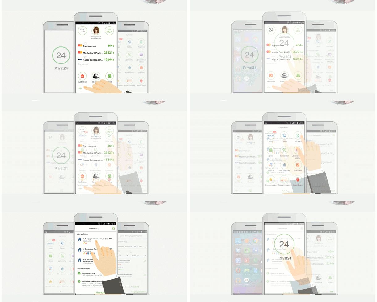
Showing visually how something works speaks louder than a thousand words. To make animation easy to understand, try to limit it with 10-20 seconds. Another way is to divide a manual into a few small steps. For example, this is how PrivatBank made a short demonstration of their app with basic steps to pay for public services.

Look, it is really faster and more convenient to pay for your utilities now. The same way any other manuals may be illustrated:
-
Use promo code
-
Make an order
-
Specifications of any product
-
App installation
-
Tips how to use a website or service, etc.
#3. Involvement
This is the best way to spark the reader's desire to use your services, order a product.
Make your goods interesting
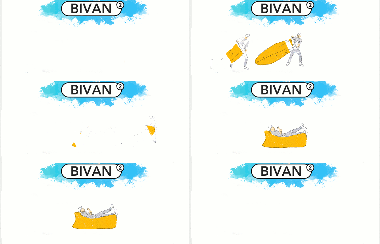
Don’t know what "BIVAN" is? Just check the MadRobots emails. See how easy to use an inflatable sofa and how compact it is.

Replace the long descriptions
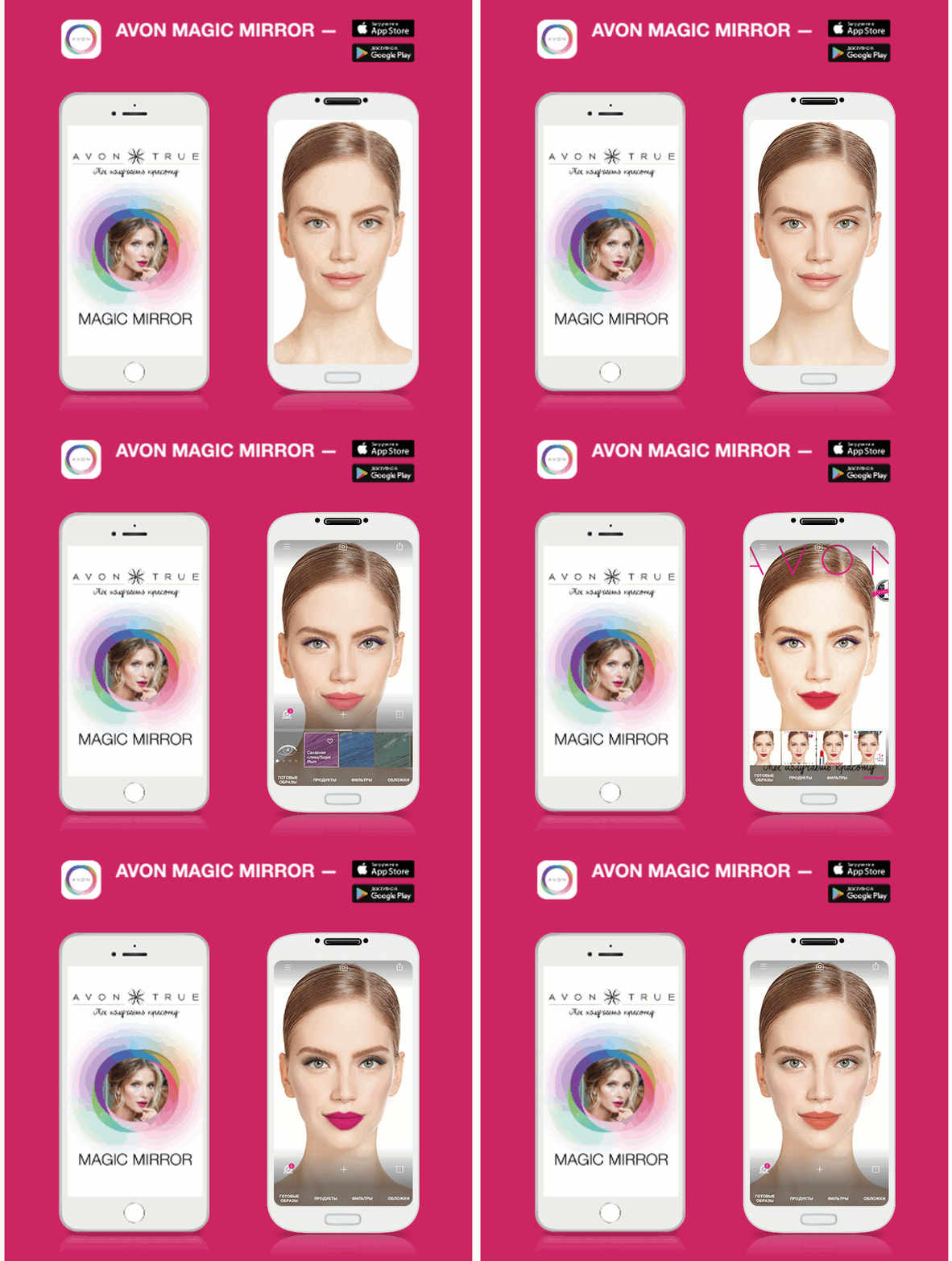
What does every girl worry about? Of course her beauty. Avon played with this in a letter. It would be boring just to write “download the app, look how easy and simple to choose your makeup”, so they showed how to change a look in seconds - this is much cooler.

Additional emphasis on some element
Do we still remember that too much animation on one screen is evil? But in order to attract more attention to one of the elements, a small animation is quite suitable. For example, this is how TOPMAN reminds about free shipping. The text may change but rotating boxes are still the same place from email to email.

It is common practice to highlight a sale block in the header. In Kideria, children’s goods online store, designers made it more creative and added a small animation to “Sale” button.
![]()
Where to Get Animation?
If you are working with a designer, he will probably do it better. Do you want to make it by yourself? There are several websites to make your task more simple. In addition, you can always hire an animator to create a set of customized animations for your emails.
Giphy.com
A lot of ready-to-use GIFs separated into categories. You can also:
-
upload your video and make a GIF
-
create an animated slideshow
-
make a picture with animated text
-
edit an existing GIF
-
install an extension to Google Chrome so GIFs will be always available
Gifs.com
The quality of ready-to-use GIFs is not always perfect but you can create your own animations, add effects, stickers etc.
If you need more tips on how to use seasonal GIFs in marketing campaigns, check our articles about Autumn and Winter GIF ideas.
Watch my educational video on emails animation and leave your comments :)
See you! ;)

