31 December 2020
11967
12 min
5.00
.webp)
How to Use Background Images in Your HTML Emails
Few emails look good without images. Right now I can only think of policy updates, legal notices, and system notifications or warnings. All the rest are more likely to benefit from good visuals that make your messages attractive, informative, entertaining, and reader-friendly.
You can read more on images in general in our special guide – How to Embed Images in an Email Properly. And below I’ll focus on a particular type of images that are email background images.
A background image is an image that’s put in the background of your email layout. You can add on top of it any element like text, emoji, image, video, CTA, timer, etc.
A background image can be applied to an entire layout (email on the left), stripe, structure, or container (email on the right).

These are templates from our editor where you can insert background images in emails without HTML code. In short, you simply upload the image to the editor and select it as a background image for the necessary element. Further, you can edit or change an email background in the in-built photoshop straight in the editor. For more details, read the full instructions.
Why to Use Background Images in Emails
In general, background images serve to make your emails more pleasant to the eye, contribute to the unique design of emails, and create a visual difference.
- They can serve as a contrast to a plain or text-only copy in emails with a minimalistic design.
- They can give your otherwise short emails volume.

- They can split a copy structure into distinct sections.
- They can help extend a certain stripe or structure, most often a header or footer.

- They can set a particular mood;
- They make your emails look beautiful.

400+ free HTML email templates for any occasion
Apart from visual design benefits, background images improve the accessibility of your emails. Many marketers like to first create banners (or other images with additional info on them) in a photo editor, and then add them to emails like a single ready image.
But people with visual impairments who use special readers to read your emails won’t be able to access this information. Such gadgets can only convert the text, so their reader will only scan and read the alt text of the image (which many don’t add). Other possibly important information will be missed.
As an example, let’s take a look at the banner of a holiday campaign by REI:

They added to a structure a background image with half of the text already placed on it: Up to 40% off. Cozy up your indoor life. The CTA and the text I’ve highlighted were layered on top of the background image. A reader can scan only these pieces of text. If the background image didn’t have the alt (which it had and which was exactly Up to 40% off. Cozy up your indoor life), people would know only about the fact of the sale and its expiration date, but wouldn’t know the exact sale amount (40%).
The same applies to when email clients fail to upload images properly. Nowadays, errors with image display happen rarely as most clients have advanced rendering algorithms. Yet, if your email images aren’t displayed as intended, they’d better not contain important information that the recipient would miss on.
Another reason to add elements over a background image rather than insert an already edited one is the convenience of copy-pasting. This is applicable to emails with promo codes or other text the subscriber is expected to insert somewhere.
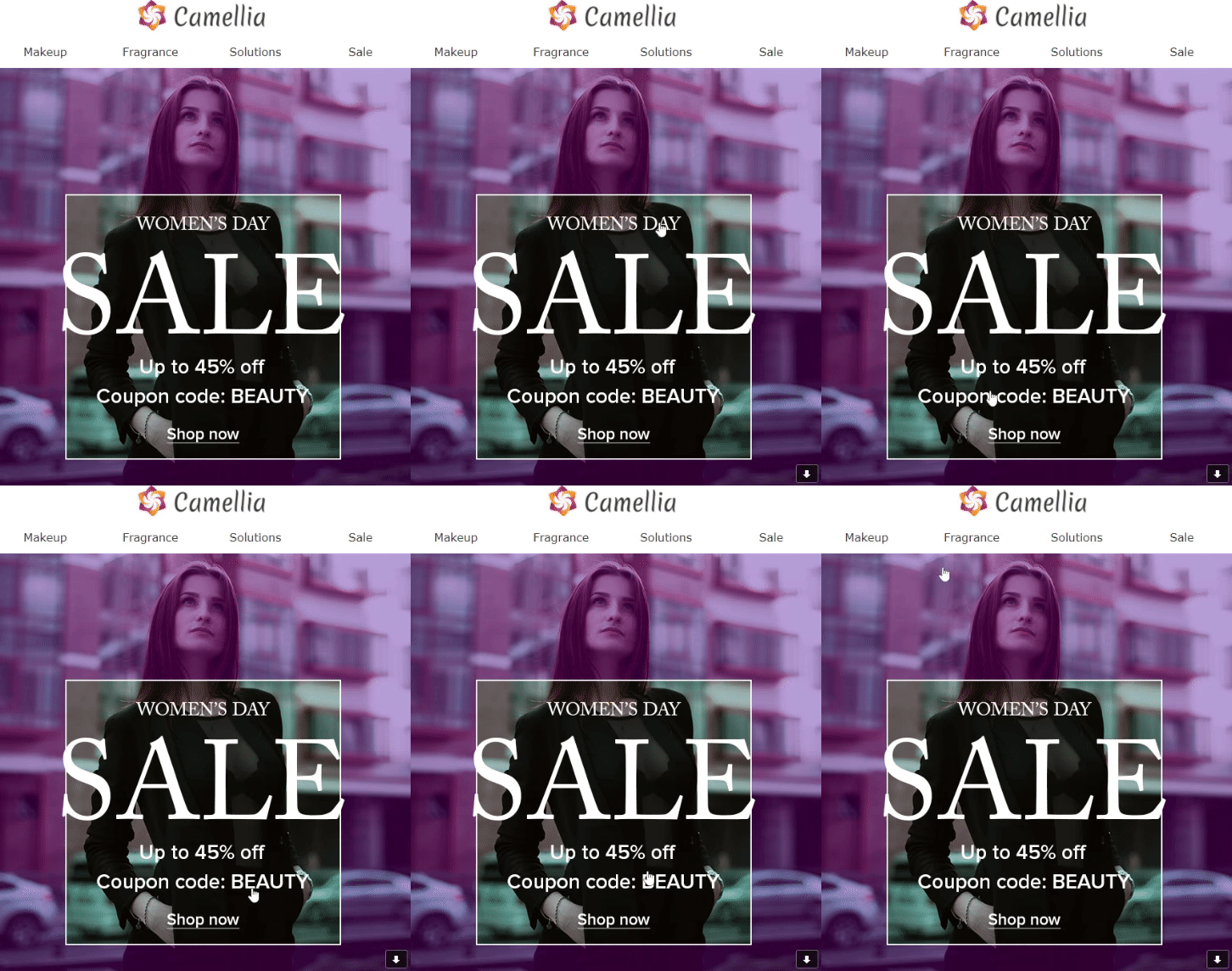
The following two emails contain promo codes placed over background images. However, the first has the code in-built in the image so you can’t copy it in one click.

You need to remember it and type manually on the site when making an order. And while it may seem easy to remember such a short word as BEAUTY, the strategy itself isn’t user-friendly and doesn’t contribute to the convenience and satisfying experience. Plus, many codes look like GHTY-783-nmYU678OID, and I believe few people would bother remembering it no matter how big sales you’re offering.
In the second email, the promo code is added as text on top of the image. So you can easily highlight, copy and enter it where needed in a second, on both desktop and mobile. And although it’s longer than the first code, it has more chances to be used.

How to Add a Background Image to an HTML Email the Right Way
- Optimize the file size.
The weight of the images doesn’t affect the email size. However, it may affect its upload speed or distort its display on different gadgets. In our editor, you can upload images of up to 2MB, but I’d recommend sticking to 1MB.
As for the image size, it will depend on the element you’re adding a background image to. However, I can give you some general recommendations to begin with:
About 1200 pixels – for the entire layout or stripe;
580-600 pixels – for a full-width structure;
250-300 pixels – for containers in a 2-grid structure;
160-200 pixel – for containers in a 3-grid structure.
- Add alts.
For the reasons I've mentioned above, add alt text to each background image. If it’s not displayed as intended, an alt will give people an idea of what’s supposed to be there.
Don’t write too long or complex descriptions. An alt should be a short crisp phrase with the essential info. For an alt applied to the entire layout, use the message of the whole campaign, for example, 50% off winter collection, free webinar on December 15, new alpaca sweater patterns. Alts used for structure or container background images should be more descriptive, for example, white boyfriend logo hoodie, webinar speakers, button-front cardigan.
Avoid too general phrases with estimative descriptions which are often subjective. A background image with an alt amazing gift for your family won’t tell anything about what’s depicted on the image because everyone has their own idea of what an amazing gift is. Infused olive oil gift set would be a more informative option.
- Set an alternative background color.
If the email client fails to render the image, the colorful background will work as a fallback. Select the color that is most close to the initial image and will substitute it with minimum loss of visual effect.
What’s more, background images for the entire layout and stripe aren’t displayed on mobiles so an alternative email background color will help your mobile audience catch up on the subject.
- When applying to the entire layout, add one background image.
It must have enough size to cover the whole layout length. If you use background images in a loop format, make sure the borders are seamless.

- Don’t use too many images within one template.
A background image should complete the overall concept and not turn your emails into a coloring book. Too many images of various types and patterns create visual dissonance and make your template look messy.

When you use different background images for several structures, consider inserting a spacer to draw a visual border between blocks.
- Use a transparent background for blocks on top.
A CTA, text or any other block on top of the background image should have a transparent background unless you make it colorful with a purpose. Otherwise, your email would have an unprofessional look.
Also, make sure the text you layer above is clearly visible and readable. This is especially applicable for containers with email background images.

- Optimize for Dark Mode.
Dark Mode is a functionality that enables to shift the interface background from light to dark. It doesn’t invert the colors of fonts, images and other content but shifts them from dark to light for better contrast and visibility. It’s available for both desktop and mobiles but most people use it mainly with gadgets.
Dark Mode doesn’t change the background image itself but it can change its background. Yes, a background image also has a background. And if it's transparent (and the image doesn’t cover it all), the email appearance will differ depending on how it’s viewed.
This is how one email looks when opened on the mobile in the default regular and dark modes. The difference isn’t critical to the content of this particular email. However, it can be so depending on your design so keep this fact in mind.

- Make your images responsive.
Responsiveness is functionality that optimizes your emails to mobile devices. In terms of images, responsiveness allows to adjust them to the width of the screen. In the below picture, you can see how responsive vs. non-responsive emails look like on mobile.

In our platform, responsiveness is enabled by default and is applied to all background images in email templates (you can disable it if needed). However, if you use other services, make sure you take of responsiveness so that your images and emails in general look as intended on any device.
All tools for marketing automation within one platform
Best Email Background Designs
And now let’s move to a more dynamic part that's great examples of using background images in emails. It’s always interesting to see how brands get creative and take advantage of the same strategy in custom ways.
National Geographic always uses full-stripe background images for banners of their The Compass series. With such a big gallery of unique photos to choose from, they definitely can make the best of this strategy.

A background image is always a good idea to create a banner, as proved by YETI and many others.

In one email, Moment teams up 2020 design trends: off-grid layout, user-generated content, mute colors.

Rifle Paper Co. adds a background image with the same floral pattern that their new phone case has. It makes the whole campaign look elegant and kind of graceful.

A simple yet cute example by Allbirds. A soothing background image doesn’t still the focus yet adds some festive vibes to this New Year campaign.

Folks at Gap know that if you use different background images for structures, it’s better to separate them with a spacer or an extra empty structure.

The overlapping effect by Frank Body looks cute and creates nostalgia over computer interfaces we had in old days.

Another overlap by Outdoor Voices. Apart from an off-grid design, background images help give credit to every user-generated picture you use in your campaigns.

Nordstrom uses a floral background image for containers and manages to create a custom design out of a seemingly simple layout.

Designers at Ben Sherman often make one image with a single focus as a defining element of the campaign.

A creative way to add a FAQ block to the email by Pasta Evangelists.

A rare example by Filson of how to combine several different themes for email background within one email.

As you see, email marketing background images give you unlimited options for creativity. And creating them in our drag-and-drop editor is really easy, as you don't have to deal with the code. Simply upload the necessary images to the system, add them where you want them in your email and edit as needed. This way, you’ll save your time, create beautiful campaigns, and make them more user-friendly.


