Content
22 November 2019
17594
10 min
4.40

20 Well-Designed Landing Page Examples and What Makes Them So Great
Content
Today, website design has developed itself to a very high standard in terms of navigation, information layout, and usability. And a powerful landing page is its main flagship. It’s responsible for a good first impression, lead generation, and overall brand image. When people see a well-structured landing page design that contains all the essential information, pricing, contacts, and applicable visual support, they automatically project its merits on the product it promotes.
But how to create a high-converting landing page that provokes action and makes people want to explore your product more? Include pretty colors? Original font? Engaging text and custom images?
In fact, all these elements are only a cover, and a true purpose of a landing page goes much deeper. People come to your website looking for a solution to satisfy their particular needs. Your landing page’s main task is to show that your product or service can help with the current challenge and improve the lives of those who would use it. Does it help avoid losses and achieve stability, improve daily routine, offer practical information, entertain, boost self-esteem? Whatever values of your offer, make sure you bring them to the attention of people with the very first words.

12 Essentials for Landing Pages that Convert
- Appealing headline. Turns a standard offer into a brilliant opportunity and highlights the unique value of your product. Has a strong focus on that one feature which makes your service stand out. If your landing page is incorporated in a marketing campaign, be it ads or email campaigns, make sure the value offer resonates with the promotional message.
- Persuasive subheads. The headline catches the attention, the subhead retains it. Typically placed under the headline, the subheadings contain more details, efficiently explaining the benefits of your offer.
- CTA. A contrasting noticeable color, large size, and persuasive custom text are three whales on which CTA design rests. Keep the balance with creativity though: a proven button format and action-oriented, commonly understood words instead of too sophisticated language are a better option to stick to.
- Custom images. Better draw the attention to intended page parts or text. Should be relevant to whatever you’re offering: physical products should have a product image; non-physical services are better to be illustrated with associative visual cues. No need to tell that a good landing page isn’t a place for free stock photos or bad Photoshop. For software or apps, screenshots or short GIF instructions can do the job.
- Copy. A clear straightforward presentation of all the advantages, options, features, or pricing plans. The more complicated service you have, the more explanatory the copy should be. If you sell socks, a good headline with a short subhead is probably enough. If you produce a complicated analytical tool, your visitors would probably like to see more than just its name.
- Guarantee. Such explicit guarantees as 100% result, trusted by # customers, satisfaction, money back, you succeed or we return the money, no spam guarantee, etc. help people take a final step to conversion. Placed next to a CTA, they double its effect.
- Video. Showing the utility of the product rather than telling may deliver a bigger result. Brief clips of an app or email editor in use show what people would get by requesting a demo or applying for a free trial. Your videos shouldn’t be long, say no more than 2 minutes, yet they need to give an insight into how the product or the company operates. Narrated by a happy customer or industry expert, it would have even bigger value.
- Understandable instruction. Bulleted steps, numbered list, clear animation, simple language formed in short sentences, illustrative icons – users shouldn’t face challenges while navigating your landing page or filling out a request form.
- Testimonials. Nothing backs up your company’s claims better than social proof and feedback by recognized brands and experts. Specific testimonials supported by real numbers, percentages and case studies work the best. Compare This service helped us a lot to This service helped us grow customer retention by 37% in 3 months. Which one sounds more appealing?
- FAQ. People most often need more details on pricing, a trial period or return policy. Reduce objections and hesitation by explicit answers provided in a short easy-to-scan format.
- Contacts. Multiple ways to reach you: an email, a phone number, social media, a physical address, support, a chat, and a contact form make your business more trustworthy. And a legit company has more chances to gain a new following.
- Navigation. Divide the landing page’s content into an accessible menu and let people move around with ease. If you feel that your landing page would perform better when supported by a product catalog or blog article, add a Read More button or a hyperlink on any related page on the website.
Sync Your Email Marketing & Landing Pages
Not all businesses need to make use of all of these elements when designing a landing page. For some businesses, a powerful headline with a relevant image may be enough; some businesses need to go further and take more than the standard route. And the best way to find out what options may work best for you is to turn to top landing pages by the experts and see how they’ve coped with the task. And if they’ve coped flawlessly, perhaps some of their approaches are worth mimicking.
20 Best Examples of Landing Pages And What to Learn from Them
Kissmetrics (Behavioral Analytics)

Key elements:
- infographics on customer success;
- main features highlighted;
- client testimonial.
Ritual (Supplement Production)

Key elements:
- subhead states the problem with food supplements and promises to resolve it;
- custom CTA;
- background with the transparent (clear) packaging correlates and supports the headline.
HeyStack (Business Management)

Key elements:
- headline addresses the pain of managing business operations;
- animated image visualizes the problem;
- customers feel that their challenges are understood.
Vivino (Wine Marketplace)

Key elements:
- red color elements resonate with the product;
- headline explains why you need to download the app;
- simple three-step instruction helps you get started.
Uber (Transportation)

Key elements:
- headline offers schedule flexibility important for most Uber drivers;
- application form on top;
- clear explanation of three biggest advantages;
- emotional supporting image.
Forbes (Media)

Key elements:
- subhead delivers the benefit of signing;
- big magazine copy below shows what to expect inside;
- CTA color stands out.
OpenDoor (Real Estate Marketplace)

Key elements:
- emotional image highlights the advantage of buying a house rather than shows the house itself;
- request a free offer drives to press a CTA with no conditions;
- number of happy customers makes the service more trustworthy.
WeWork (Office Space Solutions)

Key elements:
- headline promotes collaborative and friendly environment;
- dropdown menu and boxes optimized for a quick start;
- contact form on top is smoothly incorporated in design.
The Economist (Media)

Key elements:
- headline extends the offer beyond simple news;
- subhead supports the message with the words unrivaled, behind the headlines;
- multiple choices with an extensive explanation;
- Best Value tag catches attention and subtly prompts to decision-making.
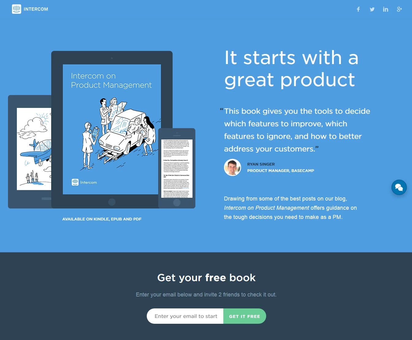
Intercom (Customer Messaging)

Key elements:
- short page’s form length;
- testimonial with a customer photo;
- different format presentation;
- free ebook in exchange for an email address.
Contently (Content Marketing)

Key elements:
- review by a major publisher is given as a headline and justifies using otherwise subjective word best;
- explicit explanatory video;
- customer logos give weight;
- easy-to-scan numbered list benefits;
- free content marketing audit.
VWO (Customer Experience Optimization)

Key elements:
- feature icons allow faster scanning;
- reputable brands as customers;
- trusted by over 4,000 customers backs up brand reputation;
- testimonial includes a client photo, position and company name making it more trustworthy;
- case studies.
Spotify (Music)

Key elements:
- short form;
- single visual focus;
- CTA straight under the offer;
- simple benefit explanations.
Shutterstock (Images)

Key elements:
- large, high-quality photo conveys the brand's purpose;
- 237 million royalty-free images emphasizes what a customer can get;
- no info mess or irrelevant CTA.
Vantiv (Credit Card Processing)

Key elements:
- image resonates with the service;
- bulleted key takeaways;
- CTA color stands out against a white background.
MeetEdgar (Social Media Scheduling)

Key elements:
- promising headline;
- all practical information in one video;
- clear background and a well-place image that doesn’t steal the focus.
TakeCareOf (Supplement Production)

Key elements:
- visual of a hand directs to a CTA;
- relevant testimonial of a doctor;
- easy steps to get started.
Bombfell (Clothes)

Key elements:
- four simple steps make the process look easy;
- focus on one product only;
- image supports the message: the box contains only clothes;
- no hidden fees.
Notarize (Online Notarization)

Key elements:
- 100% online promises a fast and convenient service;
- 100% money back guarantee is a powerful reason to keep the conversation going;
- guarantee straight under a CTA drives decision making;
- available case studies.
Slack (Messaging)

Key elements:
- short headline with the keyword work that explains what the service is about;
- service work display on a desktop and mobile.
To create a high-converting landing page, stick to these basic rules: easy-to-navigate layout, compelling offer, strong value focus, and great social back up. Continuous testing and updates based on the site visitor behaviors would help optimize and improve its design and transform more prospects into leads.


