Content
07 October 2019
38585
21 min
5.00
Effective Email CTAs that Generate Clicks: Useful Tips & Great Examples
Content
A well-designed call to action (CTA) is a real motivation booster that encourages people to continue the conversation with your brand and evolve from a visitor into a customer. It stimulates faster decisions, builds up a sales funnel, enables your audience to engage with your company, and serves as the finishing touch of your campaign.
A call to action in email marketing greatly enhances campaign effectiveness. It's hard to imagine promotional or transactional emails without a button—these elements are crucial for grabbing customers' attention and encouraging them to buy, read, or visit your website.
And here are some stats to consider: According to Wordstream, a single email CTA can increase clicks by 371% and sales by 1617% compared to emails with no call to action at all. Not bad for a small button at the end of your email, right?
And many of these tests suggest there are 3 elements that determine the success of any CTA:
- Message
- Design
- Placement
What is an Email CTA?
An email CTA is a prompt within your email that encourages recipients to take a specific action. This action could be anything from clicking a link, making a purchase, signing up for a newsletter, downloading a resource, or any other objective you want your readers to complete.

Call to action in email marketing is typically presented as a button or hyperlink with compelling, action-oriented text like "Shop Now," "Learn More," or "Download Your Free Guide." The effectiveness of your CTA can significantly impact the success of your email campaigns as it drives engagement and helps achieve your marketing goals.
Why is CTA So Crucial for A Marketing Campaign?
Now that we've established what an email CTA is and how it functions, it's essential to understand why this element is so crucial to your marketing campaigns. The importance of a well-crafted CTA extends beyond mere clicks—it's the bridge between your message and a meaningful action.
Email CTA is a linchpin of any successful marketing campaign. It links your content and your desired outcome, guiding your audience towards the next step in their customer journey. Whether it's driving sales, encouraging sign-ups, or increasing engagement, a well-crafted CTA ensures that your marketing efforts translate into tangible results.
Without a clear and compelling CTA, even the most well-designed email or advertisement can fall flat as your audience may be left uncertain about what to do next. Email CTA is what turns interest into action, making it a critical component in achieving your marketing objectives.
What Makes a Great Email Call to Action
Message
A CTA button space is often limited to a short phrase. When it comes to an email, the limit doubles. The message length typically allows you to choose two or three clear and compelling words to get the job done, so you need to make a wise choice. Short and clear, a message with a CTA should include active words like buy, get, join, visit, as well as describe the benefits of the promoted action. Guarantee, free, results, gift, new, learn, improve, etc. give a CTA more value. Get more tips instead of Subscribe states benefits rather than directly orders to act, yet the outcome is as effective.
Another effective technique for crafting CTA wording is to use language that creates a sense of urgency and compels immediate action. Words like 'now,' 'today,' 'last chance,' 'expires,' 'limited time,' and 'only' can encourage clicks from those who don't want to miss out.
To make people relate to the offer the email CTA promotes, include personal pronouns like I, me, or my. Such first-person language as I’m in or I want a free demo makes a call to action more relatable and is hard to ignore.
Here is a short list of the best email CTAs you may consider using in your campaigns, with a necessary upgrade if needed.
CTAs to Subscribe:
- Sign In
- Subscribe now
- Join us
- Join our team
- Enter the team
- Welcome on board
- I’m in
- Count me in
- Ready to subscribe
- Jump in
- Join 233,000 other subscribers
- Become one of the 23,451 people who subscribe to our blog
- Join the club
- Join the movement
- Register now
CTAs to Shop:
- Shop now
- Shop our summer collection
- Shop arrivals
- Get it now
- Shop our best sellers
- Shop sales
- Get 50% off now
- Act now
- Save today
- Buy now
- Buy it today
- Yes! I want one
- Take my money
- Order now
- Repeat your order
- Claim your discount
- Reveal my mystery coupon
- Start saving today
- Don’t delay. Save now
- See the best deals
- Redeem my prize
- Get 50% off now
- Grab your freebies now
- Shop for the clothes you want
- Get the style you want
- Get your winter wardrobe
- Get free shipping
- Free gift with purchase.
CTAs to Find Information:
- Learn more
- Read our blog
- Read our articles
- Find more tips
- I need useful tips
- I need advice
- Get free advice
- Download an ebook
- Read more
- Curious? Read on
- Download now
- Keep reading
- Read the full story
- Hear our story
- Hear from our CEO
- Watch now
- Find out how
- See how your business benefits
- I want to learn more.
CTAs for the Holidays:
- Find holiday gifts
- Shop Santa’s favorites
- Shop all Halloween
- Add holiday vibes
- Get it before Christmas
- Send love
- Send your mom a gift
- You deserve it
- Happy birthday
- Let’s celebrate
- It’s time to celebrate
- Click to start celebration
- Spread holiday cheer
- Claim your birthday coupon
- Shop birthday deals
- Yes! I want my birthday deal.
CTAs for Service Promotion:
- Book your next appointment
- Book cheaper now
- Activate your free trial today
- Start your free trial
- Act before it’s too late
- Schedule consultation
- Send me lessons
- Upgrade now
- Yes! I want a free upgrade
- Get your discount before it’s gone!
- Make me a VIP
- Don’t miss out!
- Limited quantities available!
- Sign up and save
- Start now. Get results
- Reserve your seat
- Become a master
- Make it happen
- Book your tickets
- I’m coming!
- I’ll be there!
- Book now for early bird prices
- Sign me up
- Save me a spot
- Register for our webinar
- Start your journey.
CTAs to Collect Feedback:
- Complete our 5-minute survey
- Now it’s your turn
- Have your say
- Take a survey
- Leave a review
- Give us your feedback
- Let us know your opinion
- Tell us what you think.
Create emails with powerful CTAs
Design
A good email CTA should align with the overall tone of the email. This means your CTA design should complement the email copy and reinforce its message.
Bright and glittering campaigns need to have bright calling buttons, while smooth and unicolor messages don’t need to create visual cacophony with acid colors.
Choosing a unique color that hasn’t been used before in your emails can be a good idea, as long as it maintains the right color balance. Choosing the right size is just as important. To ensure your button is the appropriate size, preview your email to see how it appears on both desktop and mobile devices. For example, in Yespo, it only takes one click to ensure your CTA displays as intended.

You can go beyond size and color, and experiment with fonts and dynamic elements, for example GIFs. One text style used for both the email body and CTA buttons would make your campaign look like a monolithic piece. In times of intense competition, you need to make use of everything capable of giving you an advantage over competitors, and a well-thought design definitely belongs to this everything.
Placement
There are two main options regarding the placement:
- Top: For subscribers to notice it without scrolling down
- Bottom: To avoid being too aggressive and pushy from the first seconds
The best approach lies somewhere in between. Determine the placement that offers the most convenient and logical interaction for your audience. If the purpose of the email is easily understandable from the very first sentence (for example, you ask to subscribe), it makes sense to position a CAT above. However, if your offer needs extra explanation (for example, you propose to upgrade an app), put a call to action after you enlist all the reasons how people can benefit from it.
You can consider putting several call-to-action buttons, but avoid being too clingy. Although multiple CTAs provide more options to get engaged and choose the best offer, their usage in email marketing requires balance. Coming across four calls to action per two paragraphs, people may feel a bit overwhelmed. If you want to provide several CTAs, give them a different message, color, size: they should have different weight rather than be complete duplicates.
How to Create the Best Email CTA?
Image CTA
If you don't want to bother with the layout, or design of your email requires unique buttons with special characteristics, like shading, glowing, animation, gradients, or custom fonts, you can always use a CTA button created in the graphics editor. Such a button will be displayed the same everywhere, but some email clients may not upload it immediately. For example, Outlook blocks image uploading by default.
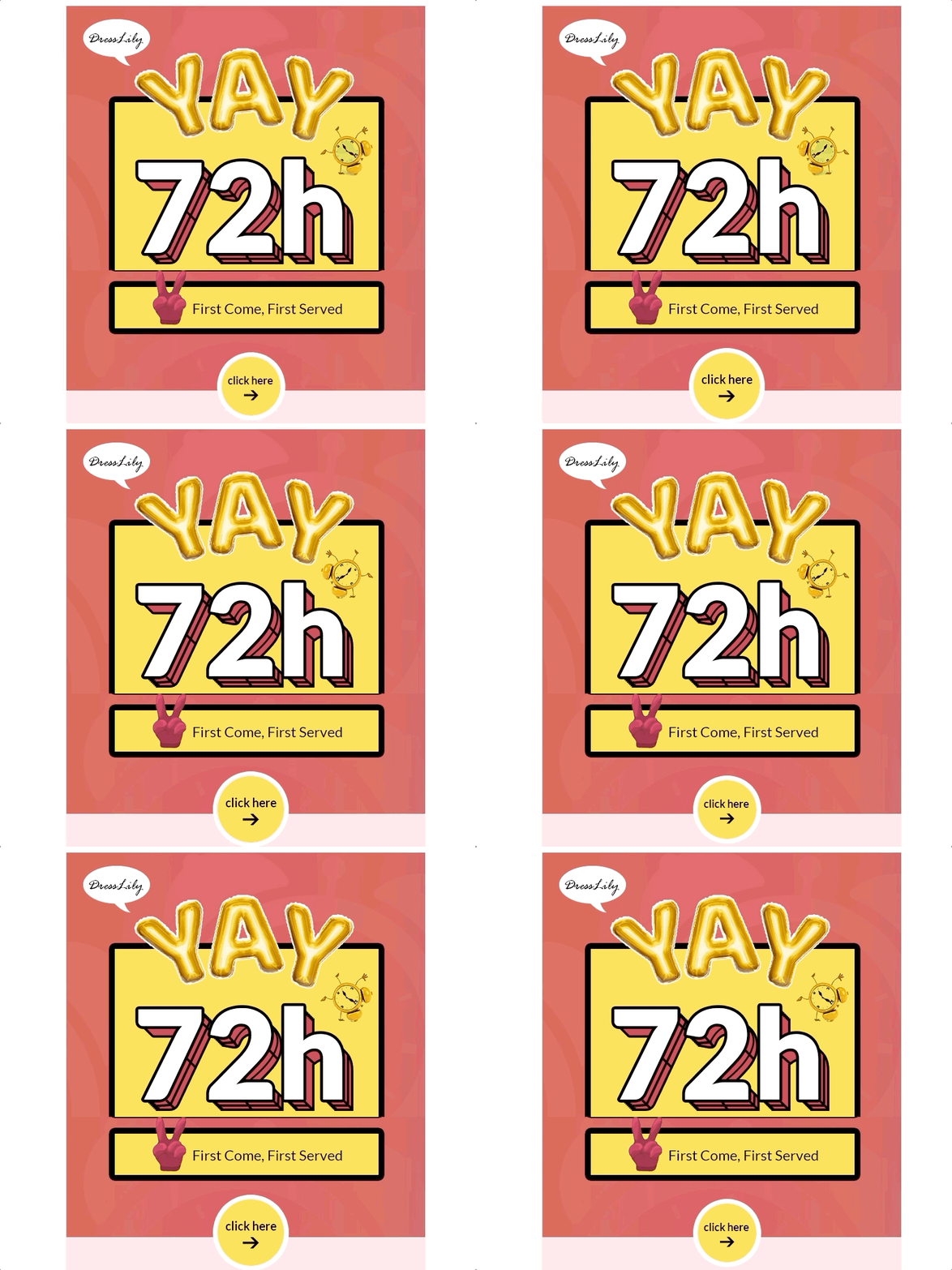
To enhance your design and add an innovative touch, consider integrating your logo or a key image into a QR code. This not only ensures visibility regardless of email client restrictions but also adds a creative element to your emails, making your call to action stand out. And don't forget to use ALT text for image buttons. Duplicate the name of your button and apply styles for Alt text formatting.
Campaign Monitor
The company has developed a tool to create buttons based on VML. VML supports the vector markup the same as HTML supports the text markup. It’s used for proper display of the button in MS Outlook.
You can easily create such a button at buttons.cm. You only need to specify the original parameters, and the code will be automatically generated. Depending on the editor where you plan to use this CTA, you may have to edit it a bit.
Code sample:
<div><!--[if mso]>
  <v:roundrect xmlns:v="urn:schemas-microsoft-com:vml" xmlns:w="urn:schemas-microsoft-com:office:word" href="http://company.com" style="height:35px;v-text-anchor:middle;width:120px;" arcsize="12%" stroke="f" fillcolor="#28b422">
    <w:anchorlock/>
    <center>
  <![endif]-->
      <a href="http://company.com"
style="background-color:#28b422;border-radius:4px;color:#ffffff;display:inline-block;font-family:sans-serif;font-size:13px;font-weight:bold;line-height:35px;text-align:center;text-decoration:none;width:120px;-webkit-text-size-adjust:none;">Buy</a>
  <!--[if mso]>
    </center>
  </v:roundrect>
<![endif]--></div>
Yet, you may need to do some more work with the code later. While it looks good in Outlook, it's not universally adaptable due to its fixed size. You'll need to regenerate it regularly, adjusting the size based on text length and font. Otherwise, the text will be split into two lines.
Create a CTA in a drag-n-drop editor
MailChimp
The company offers table-based buttons. You can find a sample button at Buttons.
Code sample:
<table border="0" cellpadding="0" cellspacing="0" style="background-color:#28b422; border-radius:4px;">
  <tr>
    <td align="center" valign="middle" style="color:#FFFFFF; font-family:Helvetica, Arial, sans-serif; font-size:16px; font-weight:bold; letter-spacing:-.5px; line-height:150%; padding-top:10px; padding-right:10px; padding-bottom:10px; padding-left:30px;">
      <a href="http://company.com" target="_blank" style="color:#FFFFFF; text-decoration:none;">Read More Stories On Our Blog</a>
    </td>
  </tr>
</table>
Note. This code works as intended only in MailChimp because it uses its styles. On other platforms, you may need to do some editing. For example, in our system, click the container and delete width=”100%” in its code. Set the background color of the container as it’s transparent by default.

A click on such a button will work only if you click exactly the button text. The button also has a lot of code which means it will increase the size of the email.
Yespo CDP
We build our buttons wrapped in to create a border or shading around the button.
Code sample:
<td align="center" class="esd-block-button es-p10" style="" bgcolor="transparent">
<span class="es-button-border" style="border-width: 4px; background: rgb(40, 180, 34);">
<a href="http://company.com" class="es-button" target="_blank"
style="background: rgb(40, 180, 34); border-color: rgb(40, 180, 34);">Show more</a> </span> </td>
We don't set fixed-size buttons; that’s why they adapt to the entered text lengths and width.
The borders of the button around the text are configured as border widths of span. It enables the button to keep its volume in Outlook and not turn into a link with a colorful background. However, Outlook doesn’t support the CSS property called border-radius. Therefore, a rounded button will be displayed in a sharp-edged way in Outlook.

To add a button to the email, simply drag the block Button to the template.

You can configure button settings in a few clicks even without HTML knowledge:
- Link
- Text
- Text’s style and size
- Color scheme of the text, background, and buttons
- Alignment, border radius, and width
- Icon (not supported for Windows Outlook 2002, 2007, 2010, 2013, 2016, 2019)
- Padding
- Presence (you can hide a button for certain devices (PC or mobile))
- Layout (HTML, AMP, or both)
- Event type (a click can automatically trigger a related workflow, such as a welcome series after the subscription confirmation)

In addition, if the buttons in the email are the same, you can customize the design for all of them in Appearance > Button: colors, border radius, borders and font, and highlighting. To do this, enable Highlight hovered buttons and choose alternative colors which will appear instead of the main when being hovered over:
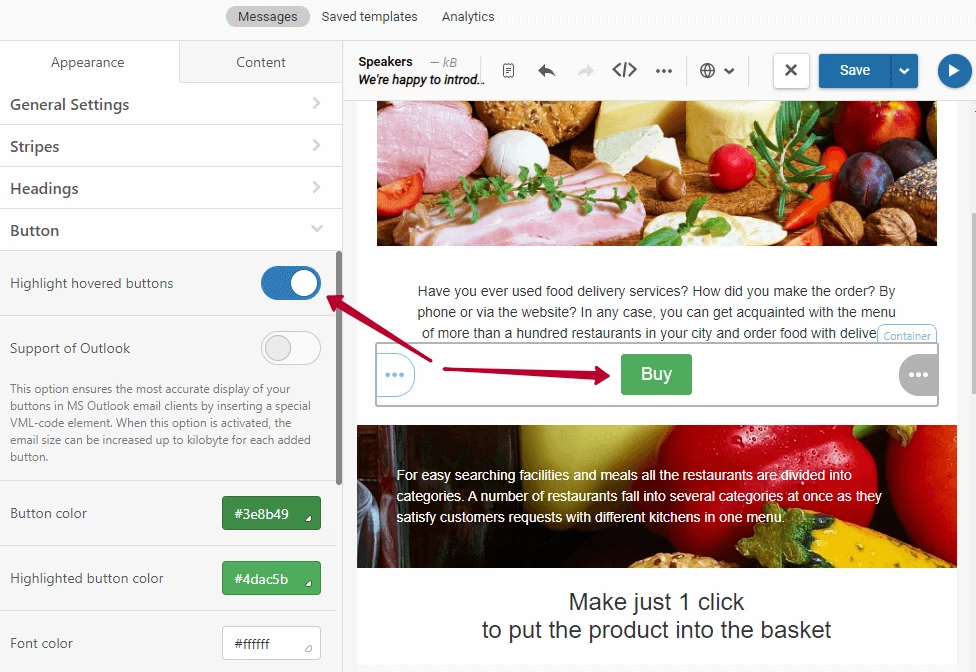
You will be able to able to add buttons with the previously made design, saving time on the layout. And still, you will be able to edit each of them separately.
Another useful option is Support of Outlook. It allows you to convert a button in VML so that the design in this email client is displayed as accurately as possible. For example, the border radius may remain rounded if you choose so. Enable it if you have recipients reading emails in Outlook or in <9 IE.
Note that each such button can add up to 1 KB to the size of the email.
And here's how the button looks like without and with VML:

Call to Action in Email Marketing: How Major Brands Do It
Now we’re moving to the best part—cool examples and winning techniques from the most original companies around. Some of them gave standard CTAs a fresh look, and some went really creative with a custom design. According to Hubspot, a smart (custom) CTA converts 202% better than the default (standard) versions. A good motivation to go beyond Subscribe or Buy Now, isn’t it?

Short CTA Buttons in Email
- Go Hunting
Using the same language, the CTA correlates with the message in the email’s body and gives it playful vibes.

- Float On
Even not knowing that Oru Kayak designs folding kayaks, one can learn from their email CTA that these folks are somehow related to water activities.

- Peel out and shop
The CTA color resonates with the central image of the email and contains the upgraded option of a default Shop.

- Reveal More
The image and the CTA make one composition: it’s not easy to visualize such phrase as Reveal More, but a fortune cookie by J.Crew did the trick.

- Get Started
Billie employed a rather creative approach towards a usual button. Their razor release looks like an art performance rather than a commercial promo. The color of the product is incorporated in the CTA, making it a logical continuation of the offer.

- Explore the Looks
This is a non-direct CTA that is inviting instead of directing. With that said, Lancome wants you to check the makeup ideas for Halloween, with no purchase intended.

- Treat Yourself
This we-miss-you email by Missguided is designed in a non-aggressive style and pastel colors, and so is a petite CTA Treat Yourself. No extra images, no bright colors, no complex structures—just the plain text, cute emojis, and a cute call.

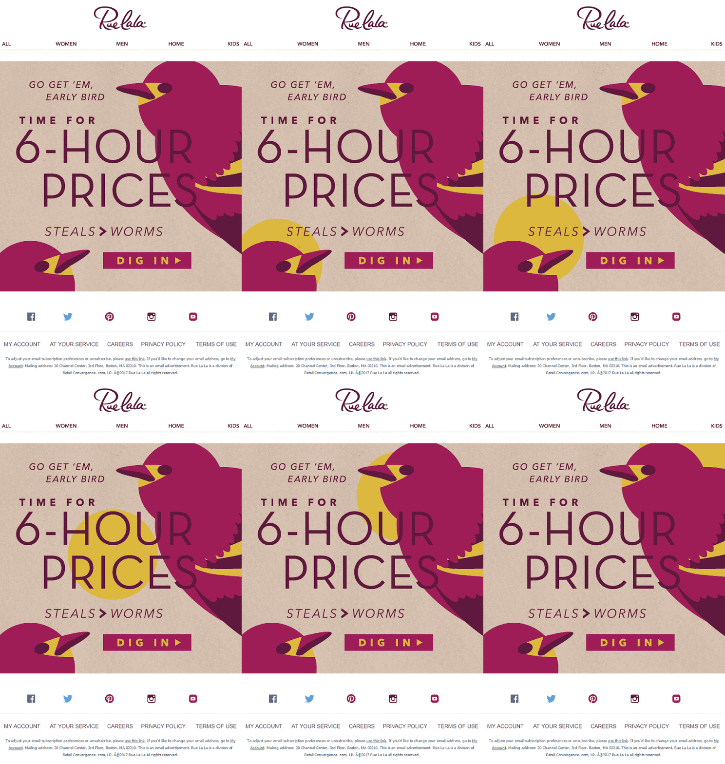
- Dig In
Short doesn’t necessarily mean boring—proved by Rue La La. And the best part about this campaign is a perfect color match of every element.
- Choose Your Friends
This is how you kill two birds with one stone: with one email, Harry’s reminded of their existence and potentially collected new email addresses.

- HI-YAH!
Who would have thought that Start Now can have such an unexpected yet perfect synonym.

Long CTA Buttons in Email
- Get It Before The Weekend
A sense of urgency + humor make perfect ingredients for the CTA of the last-offer campaign by Chubbies.

- Shop the Halloween Boo-tique
Modcloth used basic elements of an event-triggered email: a recognized holiday-themed symbol, a GIF, play of words in the email body, play of words in the CTA.

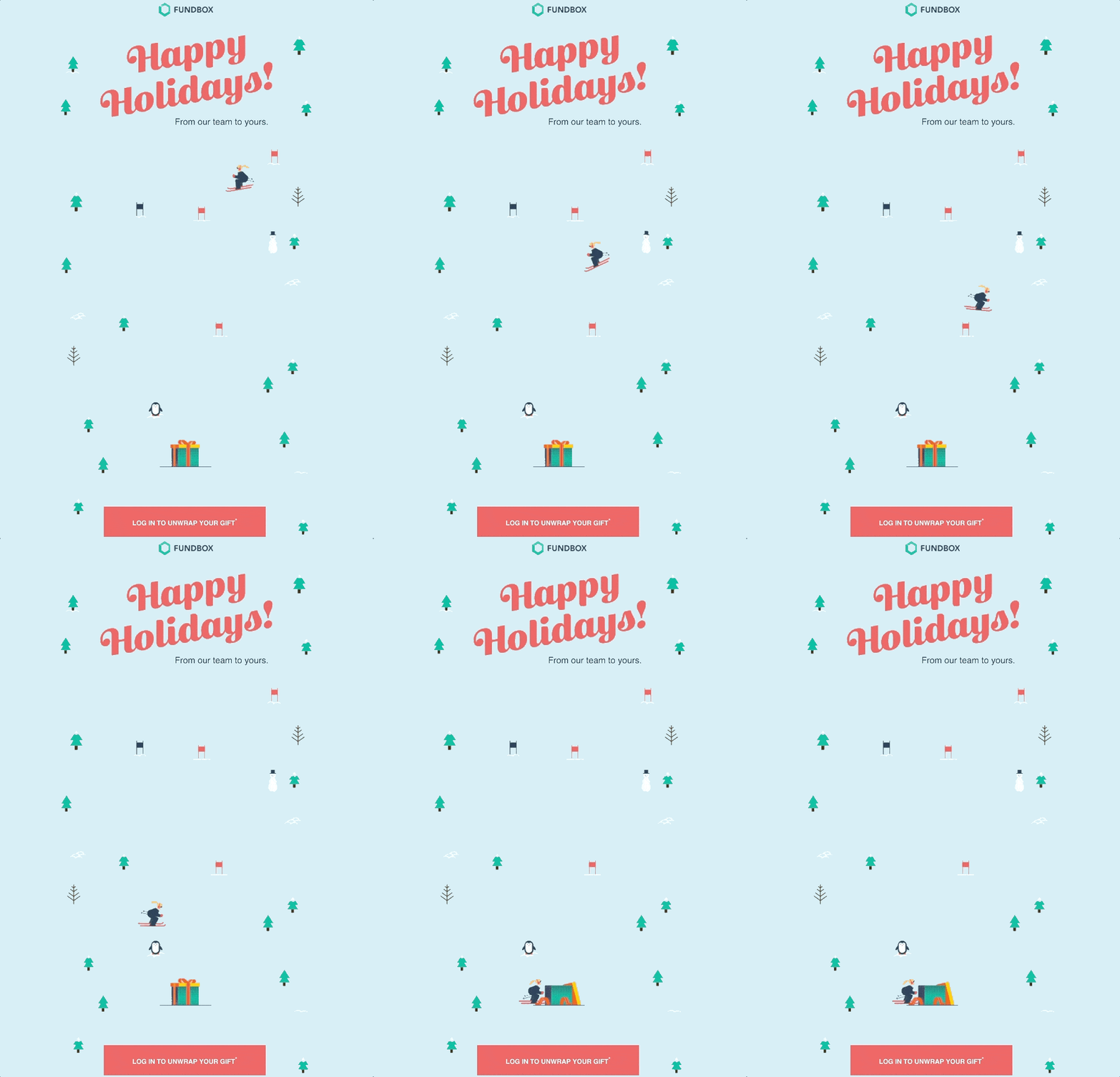
- Log In to Unwrap Your Gift
Folks from Fundbox went beyond a simple Get Gift and made their email CTA Christmas-themed as well.
- Get on the Guest List
This CTA makes you feel a guest, not a customer. And it’s psychologically more convenient to accept a friendly offer rather than respond to a commercial.

Multiple CTA Buttons in Email
- Sharing is caring by Bombas: simple steps to follow and simple CTAs to click on.

- Four CTAs with different purposes let subscribers skip the irrelevant information and get straight to what they’re most interested in at the time being.

- All three CTAs by Charity Water aim to tell new subscribers about their organization. Starting with an introduction is a smart choice for a welcome email.

- Don’t need a coupon, move on to reading. Not interested in our articles, tell us why. This welcome email not only serves its main function of actually welcoming but also performs the role of a feedback request.

- At first, Stylist Live provides the extensive info on the event, its focus, speakers and location, and only then suggests to see more sessions and buy.

These examples demonstrate that even a small change in a CTA can make a big difference. If you're a subscriber to blogs or newsletters, think about which buttons you would be most likely to click on as a customer.
Like your overall email marketing strategy, the types of CTA that would suit you depend on your industry, audience, and the campaign’s purpose.
Hopefully, the variety of CTAs listed above can help you get started. Next, you need to experiment and figure out what email CTAs can make the most impact on your audience.
And, of course, in the article on CTAs, we couldn’t help but add ours. You can subscribe to our blog by clicking on the one you like the most.


