30 December 2019
11457
8 min
5.00

Latest Email Design Trends for Fashion eCommerce
In our blog, as well as on many other email marketing platforms, you can come across multiple advice on how to create a perfect email. No doubt, many of these tips (ours for sure) are worth taking into account, but as they say, it’s better to hear once than to hear about it a thousand times.
So, we’ve checked our Inboxes, picked up the best email design solutions by fashion brands, and are ready to share the most creative findings. They’ll give you some idea of what’s going on in fashion email marketing, and hopefully inspire for new upgrades.
Diversity in Modeling
Looks like body positivity has rooted in email marketing for good. Brands have realized that people want to see more real-life models any of us can relate to. Brands started including in their email campaigns models of different size, color, age, and physical conditions.
Reebok was one of the first who understood that fashion has become democratized, and it’s time to adopt.

Anthropologie has also started featuring plus-size models. Women with different bodies make the brand closer to its as different audience. Plus you can see how the outfit would actually look on you, because how many typical female customers wear XS?

Men’s clothing brand Bonobos didn’t lag behind. One of their promo campaigns is titled Let’s find your perfect fit, and the message inside totally corresponds with the subject line. The outlooks are provided for each type, and a click forwards to a fit guide, where you can see different combinations and pick that works for you.

Having a seemingly simple design, the campaign delivers a rather powerful message - We know our audience is different, and we are ready to provide a solution for everyone. So worshipped by everyone personalization in action!
Loft is sending a similar message by putting their team member alongside campaign models - We know what you may need because we need the same. Such a simple trick makes otherwise regular promo more personal and human-like, and looks like a kind of message you might receive from your friend.

Diversity among models has officially entered email template design, and it’s all about inclusiveness. People no longer want to look like celebrities, they want to be celebrities, in their own bodies and sizes, and so the industry needs to keep up.
Personalized emails for better engagement
Customer Generated Content for Email
Asking to tag your product on Instagram and then repost it isn’t a new thing. Social media is one of the main channels of product promotion, and you’ll hardly find a brand without at least one social account.
However, using customer’s photos as the element of email marketing design looks like something new. Today’s most major companies understand that a focus on the customers is what can help build a loyal base and committed community.
Ann Tylor shares the look of the customer, and then invites to shop similar items.

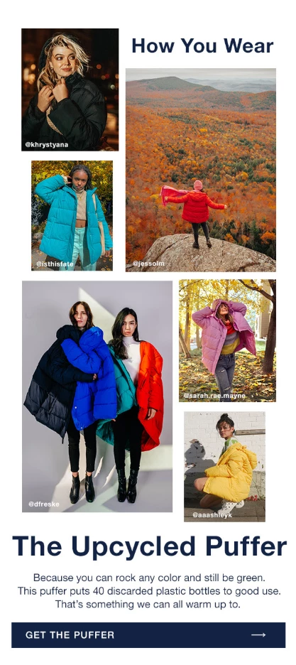
GAP promotes a certain product, the upcycled puffer, using the customers’ photos and showing how this piece would look and function in real life.

Honest has built the entire campaign featuring babies wearing company’s diapers.

For email marketers, using customer-generated photos can be a good idea for several reasons:
- the quality of today's smartphone cameras allows to make professional photos;
- before going online, all images are edited and strictly examined; only the best get public;
- real-life models and unique settings give a taste of the product;
- firsthand photos are always custom;
- each photo is a piece of visual storytelling;
- customers get involved with the product, and can show off their creativity;
- brand builds a dedicated community.
In case such photos don’t have a place in your emails, you may consider using some. Don’t be afraid to ask your followers to share: the loyal audience who likes your service would be glad to participate.
Animation Alive
Animation and GIF have been in email design for a while, and it doesn’t look like they’re going away. Brands keep on opting for animated elements, as they bring up dynamic vibes, and make campaigns more entertaining.
The design by Reebok, with one image and minimum text, could have been called too simple if not for a glimmering background.
The same technique by Bombas: one dynamic element makes the whole campaign a bit more entertaining and festive.

Chubbies, in their trademark manner, went for a humorous angle, complementing their Christmas campaign with a funny preheader GIF. It definitely sets the mood and encourages to at least consider the offer coming next.

Banana Republic and GAP use animation to introduce the product range. The practice isn’t new yet still in use by many fashion brands.


However, with the AMP technology on the rise, such functionality can soon be performed with an AMP-supported carousel, as it enables including more images for better showcase, saving the copy space and keeping the interactivity.

Newsletter Renaissance
Somehow, newsletters are believed to be a tool of publishers, soft companies, educational platforms, etc. rather than of the fashion industry. Any newsletter sent by a clothing company is straight considered a promo as it supposedly should describe limited collections or new editions only.
However, there are more reasons to reach your customers than just by offering sales or free shipping. Many fashion businesses have incorporated in their automated campaigns some pieces of storytelling, brand introduction or style guides.
With not many promo codes or CTAs, if any, fashion newsletters can still do your company a big service, turning into effective multitaskers when it comes to reminding of your brand’s existence.
In the campaign following a welcome email, Kate Spade tells how it all started, and what were the company’s main milestones.

Rag & Bone introduces its products without too obvious purchase prompts, by just asking to explore and get to know each other better.

J. Crew shares style stories, and offers style guidelines for any taste.

Regardless of the industry, there should be something you can share with your audience beyond standard % off. If not, what’s the point of being subscribed to you? No doubt, people like sales and discounts; but they also like to be part of the community where there’s always something going on. And by far newsletters remain those insight providers that show your readers they’ve come to the right place.
Besides maybe IT, the fashion industry is expanding by leaps and bounds, and has shifted 360͒ from what it was even two years ago. Such shift happened due to the intense competition that causes the urgent necessity to constantly look for new ways to catch customers’ attention.
As still the main channel of communication, email remains that launching ground where all new or reintroduced design trends, ideas and findings are implemented in the first place. Modeling inclusivity, user generated content, upgraded animation and reinvented storytelling - are only some of the recent tools fashion brands have been taking advantage of. Each new campaign brings up new philosophy, and watching this never-ending evolution never gets old.


